

Combo charts and dynamic chart ranges in Excel
Watch alongside this article
Public YouTube resources matched to this article's topic, functions, and practice goal.

Excel Charts & Graphs: Learn the Basics for a Quick Start
Leila Gharani
Open on YouTube (opens in a new tab)

Interactive Excel Charts and Dashboards - Data Visualization Course
Simon Sez IT
Open on YouTube (opens in a new tab)Once you’re past picking a chart type and cleaning up titles and labels — covered in how to create a chart in Excel — two problems show up in almost every real report. Two series with mismatched scales end up looking wrong on one chart, and a chart that looked fine last month quietly stops including this month’s row. Both have a specific, reliable fix.
Combining two chart types with a secondary axis
A combo chart puts two chart types on the same plot — usually columns for one series and a line for another — so you can compare two measures that don’t share a scale. The classic case: a dollar amount and a percentage.
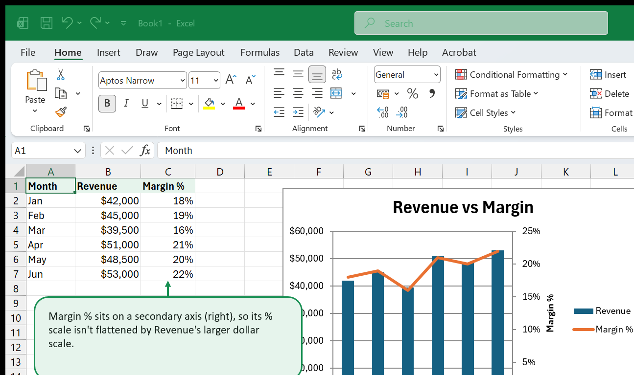
Revenue here runs into the tens of thousands; margin runs between 0% and 100%. Plotted on the same axis, the margin line would sit flattened against the bottom of the chart, barely moving. Putting it on its own secondary axis gives it the vertical room to actually show its own ups and downs.
To build one:
- Select your data, including headers, then Insert > Recommended Charts or a plain column chart to start.
- Right-click the series you want to change (here, Margin %) and choose Change Series Chart Type.
- In the dialog, set that series to Line, then tick Secondary Axis for it. Leave the other series on the primary axis.
- Label both axes — a chart with two unlabeled y-axes forces the reader to guess which scale belongs to which series.
When it’s warranted: genuinely different units (currency vs. percentage, count vs. ratio, actual vs. index). When it’s a trap: using a secondary axis to make two unrelated series look correlated by adjusting their scales until the lines happen to cross or track together. If you find yourself tweaking axis min/max just to make two lines “line up” on screen, stop — you’re no longer showing what the data says.
Charts that grow with your data
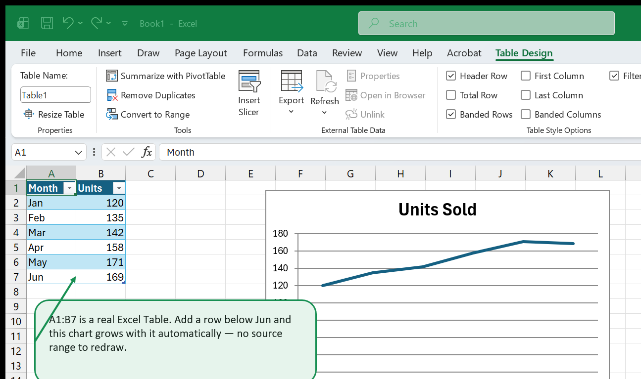
The second problem is quieter: you build a chart from A1:B12, it looks
right, and then next month you add row 13 — and the chart doesn’t move. It’s
still charting through row 12, because a chart built from a plain cell range
only ever knows the exact range you gave it.
The fix is the same one behind a lot of this site’s advice on
Tables & Structured References:
select your range and press Ctrl+T to turn it into a real Excel Table
before you build the chart from it. A Table has a name, a defined boundary,
and — critically — that boundary automatically expands the moment you type a
value into the row directly below its last row. Build the chart’s source data
from inside that Table range, and the chart expands with it. No named range,
no OFFSET formula, no re-selecting the source every time the report updates.
If you’re not ready to convert the whole sheet to a Table (some workbooks have
reasons not to — see
Excel Tables vs. named ranges for
the trade-offs), a dynamic named range built on OFFSET or INDEX achieves
the same growth without the Table’s other side effects, at the cost of being
harder for someone else to spot and maintain later.
Putting both together
A combo chart and a dynamic range aren’t mutually exclusive — base a combo chart’s data range on an Excel Table and you get a chart that both compares two mismatched measures correctly and keeps including new months without anyone touching it again. That combination is most of what a recurring management report’s chart actually needs.
Go deeper with this skill
Choose a chart that answers one question clearly instead of decorating the worksheet. For this article, the goal is to practice: Two chart techniques that come up in almost every real report: combining two chart types on a secondary axis, and building a chart that grows on its own as new data arrives.
Practice workbook setup
Prepare a table with a date or category column, one main metric, and one comparison metric.
Practice workflow
- Write the question the chart should answer before choosing the chart type.
- Create a simple chart first, then remove gridlines, excess legends, and duplicated labels.
- Use one accent color for the value you want readers to notice.
- Add a plain-English title that states the insight, not just the chart type.
Quality checks
- The chart has one obvious main message.
- Axis labels and number formats match the source data.
- Colors are readable and not overloaded with too many meanings.
Common mistakes
- Using 3D, pie, or combo charts when a bar or line chart would be clearer.
- Letting Excel's default legend repeat information already visible on the chart.
- Showing too many categories without sorting or grouping them.
Next actions
- Create a second version of the chart for a manager who has only 15 seconds to read it.
- Add the chart to a one-page dashboard and check whether it still works at smaller size.
Formula focus: even if this workflow is not formula-heavy, add one check cell that confirms the final output still matches the source data.


