

A table full of numbers can answer a question – but a chart lets you see the answer before you even finish reading the title. This book teaches you how to turn raw Excel data into clear, honest, useful visuals: the chart types that cover 90 percent of real work, the formatting choices that make them readable, and the habits that keep them from misleading anyone (including you).
Everything here uses one running example – a fictional small business called Greenleaf Garden Supply – so every chart builds on data you have already seen. No prior charting experience is assumed; if you can enter data in a cell, you are ready to start.
Twelve chapters, each short enough to finish in one sitting. Work through them in order the first time, then keep the PDF as a desk reference whenever you need to build a new chart.
1. Why Visualize Data
Goal: Understand when a chart is worth making, and when a table is the better choice.
Numbers are powerful, but the human eye is not built to scan a column of 200 values and spot the trend. Charts work because they convert quantity into length, position, and color – things the visual system processes almost instantly. A well-made chart passes what data-visualization experts call the five-second rule: a reader should understand the main message within five seconds of looking at it. If they have to squint, count bars, or read every label before the point lands, the chart needs work.
When charts beat tables
- Trends over time. A line going up or down is instantly obvious; a column of monthly totals is not.
- Comparisons. Side-by-side bars make differences jump out. A table forces readers to subtract in their heads.
- Proportions. A stacked bar or pie chart shows “this part is about a third” faster than the numbers 34.2%, 28.1%, 37.7%.
- Outliers. A single dot sitting far from the cluster in a scatter plot is impossible to miss; the same value hiding in row 147 of a table is easy to overlook.
When tables beat charts
- Exact values matter. If someone needs the precise number – an invoice total, a part number, an account balance – a chart rounds and hides. Use a table.
- Only a few numbers. Three values in a row are faster to read than a chart with three lonely bars and a title and axis labels surrounding them.
- Lookup tasks. “What was the March figure?” is a lookup, not a visual comparison. Tables handle lookups; charts handle comparisons.
The rest of this book focuses on the charting side. For tables, formatting, and conditional formatting as a lightweight visual layer, see Excel for Beginners and Chapter 10 of this book.
The Greenleaf dataset
Every chapter from here on uses the same small dataset. Greenleaf Garden Supply tracks monthly revenue across four product categories – Seeds, Tools, Soil, and Planters – for a full calendar year. The data lives in a simple table:
| Month | Seeds | Tools | Soil | Planters |
|---|---|---|---|---|
| Jan | 1200 | 3400 | 890 | 650 |
| Feb | 1350 | 3100 | 920 | 700 |
| Mar | 2800 | 4200 | 1500 | 1100 |
| Apr | 4100 | 5600 | 2800 | 1900 |
| May | 5200 | 6100 | 3200 | 2400 |
| Jun | 4800 | 5500 | 2900 | 2100 |
| Jul | 3900 | 4800 | 2400 | 1800 |
| Aug | 3200 | 4200 | 2100 | 1500 |
| Sep | 2400 | 3800 | 1600 | 1100 |
| Oct | 1800 | 3500 | 1200 | 850 |
| Nov | 1400 | 3200 | 1000 | 700 |
| Dec | 1100 | 3600 | 1050 | 680 |
Type this into a new workbook now (or keep it handy as you read). Put
“Month” in A1, the category names in B1:E1, and the data in A2:E13. Select
the whole range including headers and press Ctrl+T to convert it to an
Excel Table – name it Sales on the Table Design tab. Every chart in this
book is built from this table, which means every chart automatically expands
if you add rows later.
Throughout this book, when a formula references the dataset, it uses
structured references like Sales[Seeds] rather than raw cell addresses,
because the data is a named Table. If you are unfamiliar with Tables and
structured references, the Tables & Structured References
topic page covers the basics.
2. Your First Chart
Goal: Select data, insert a chart, and understand the three objects Excel creates.
Making a chart in Excel takes about five seconds. Understanding what Excel actually made takes a few minutes – and that understanding is what makes every later chapter click.
Step by step: insert a chart
- Select the data. Click cell A1, then press
Ctrl+Shift+Endto select the entire Sales table (headers and data). Excel needs the headers to label the chart automatically. - Open the Insert tab on the ribbon.
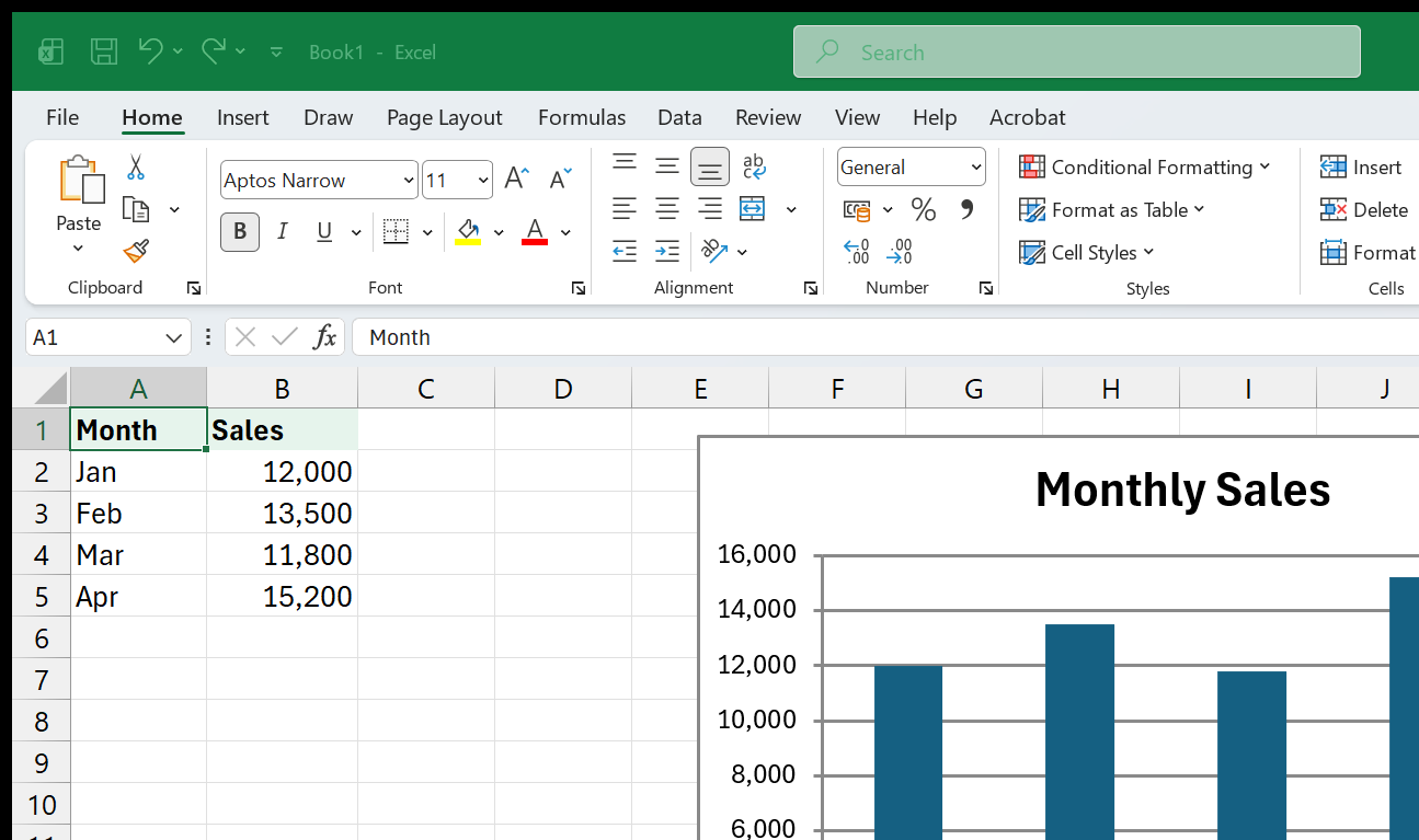
- Pick a chart type. In the Charts group, click the icon for a Clustered Column chart (the very first icon in the Column/Bar section). Excel drops a chart onto the sheet immediately.
That is it. Three clicks and you have a chart. But look at what Excel created – there are actually three things on the screen now:
- The chart object – a box you can move and resize by dragging its edges. Click once on the chart to select it; click outside the chart to deselect it.
- The Chart Design tab – a ribbon tab that appears only when the chart is selected. It holds layout presets, color schemes, and the “Change Chart Type” button.
- The Format tab – another ribbon tab for fine-grained appearance (fills, outlines, effects on individual chart elements).
Moving and resizing
Click once on the chart to select it (you will see a border with round handles at the corners and midpoints). Drag any corner handle to resize proportionally. Drag the chart body (not a handle) to move it. To place the chart on its own dedicated sheet, right-click the chart, choose Move Chart, and select New sheet. Many people prefer chart sheets for presentation-quality output, but for a dashboard that shows data and charts side by side, keeping the chart embedded on the data sheet is usually better.
Recommended Charts
Not sure which chart type fits your data? Excel has a built-in advisor. With your data selected, go to Insert > Recommended Charts. Excel analyzes the shape of the selection – how many series, whether the first column looks like categories or dates – and suggests a short list of chart types ranked by likely fit. It is not always right, but it is a useful starting point when you are unsure.
Quick Layout and Chart Styles
On the Chart Design tab, two galleries save time:
- Quick Layout – predefined arrangements of title, legend, axis labels, and data labels. Pick one that is close to what you want, then fine-tune the pieces individually.
- Chart Styles – color-and-shading presets that follow your workbook’s theme. These are safe to use because they keep your charts visually consistent with each other.
The keyboard shortcut
Select your data range and press Alt+F1 to insert a default chart
instantly on the current sheet. Press F11 to insert it on a new chart
sheet instead. Both use whatever chart type Excel considers the default
(usually Clustered Column). These shortcuts are the fastest way to get a
rough chart on screen when you just want to eyeball the data.
Switching chart types
Made a column chart but realized a line chart tells the story better? No need to start over. Click the chart to select it, then go to Chart Design > Change Chart Type. Excel opens a gallery showing every available type. Pick a new one and click OK – the chart redraws instantly, keeping all your data and formatting. You can also right-click the chart and choose Change Chart Type from the context menu.
This is the safest way to experiment: create any chart, then iterate. Do not agonize over picking the “right” type before clicking Insert – you can always change it in two clicks.
Deleting a chart
Click the chart to select it (you will see the border with handles), then
press the Delete key. The chart disappears but the underlying data is
untouched. If you accidentally delete a chart, press Ctrl+Z immediately
to undo.
Copying a chart to another application
Need the chart in a Word document or PowerPoint slide? Click the chart,
press Ctrl+C, switch to the other application, and press Ctrl+V. By
default, Excel pastes a live-linked chart – if you change the data in
Excel, the chart in Word or PowerPoint updates too. If you want a static
image instead (useful when emailing a document to someone who does not have
your workbook), use Paste Special (Ctrl+Alt+V) and select a picture format
like PNG or Enhanced Metafile.
3. Column and Bar Charts
Goal: Know when to reach for columns versus bars, and how to control gap width, data labels, and series overlap.
Column charts (vertical bars) and bar charts (horizontal bars) are the workhorses of Excel charting. They compare discrete categories – products, months, regions, people – by encoding values as bar length. The visual system reads length differences effortlessly, which is why bar-style charts top almost every data-visualization expert’s recommendation list.
Column vs. bar: when to use each
- Column (vertical) – best when the categories have a natural left-to-right order, especially time (months, quarters, years). The Greenleaf dataset’s monthly revenue is a natural column chart.
- Bar (horizontal) – best when category labels are long (product names, department names, survey questions) or when you have many categories. Horizontal labels are easier to read than angled or vertical ones. A simple rule: if you find yourself rotating axis labels to make them fit, switch to a bar chart.
Building the chart
Select the Month column and one data column – say, Seeds (A1:A13 and
B1:B13). Hold Ctrl while selecting the second range to grab non-adjacent
columns. Then Insert > Clustered Column. You get a simple twelve-bar chart
showing seed revenue by month, with months along the horizontal axis.
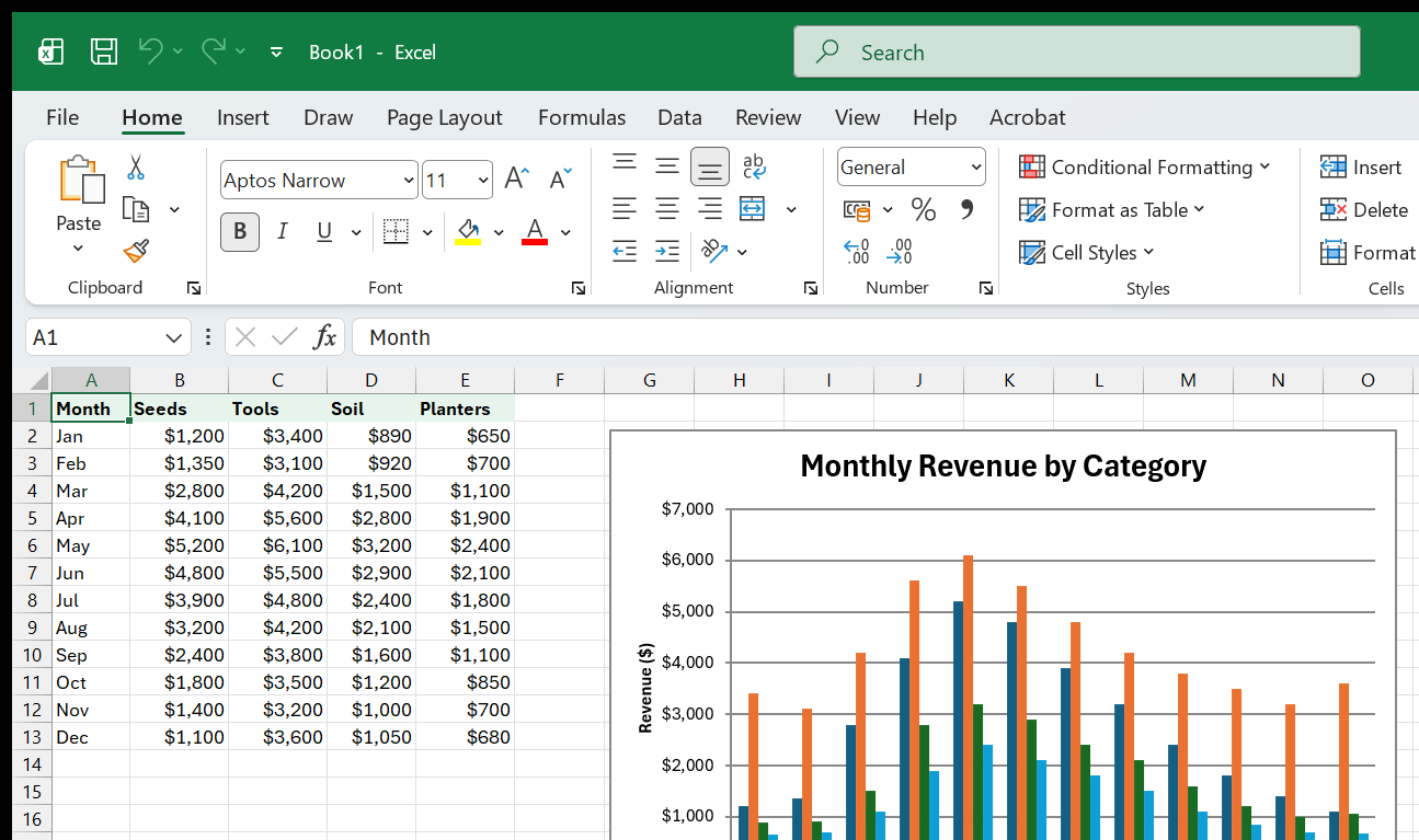
To show all four categories at once, select the entire table (A1:E13) and insert a Clustered Column. Each month now has four bars side by side, one per category, color-coded by the legend.
Stacked columns
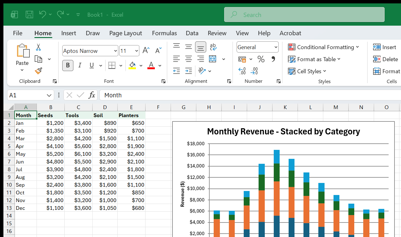
A stacked column chart puts the four categories on top of each other instead of side by side. The total height of each stack is the month’s total revenue; the colored segments show each category’s contribution. To create one: select the same data, then Insert > Stacked Column (the second icon in the Column section).
Stacked columns are excellent for showing how a total is split, but they make it hard to compare individual categories (except the bottom one, which shares a common baseline). Use them when the total matters more than the parts; use clustered columns when comparing individual categories matters more.
100% Stacked columns
The third column variant – 100% Stacked Column – normalizes every bar to the same height and shows each category as a percentage of the total. This is useful when the absolute totals vary wildly and you want to compare proportional mix. For Greenleaf, a 100% stacked column would show how the revenue mix shifts from winter (Tools-heavy) to spring (Seeds-heavy) regardless of whether total revenue is higher or lower.
Formatting: gap width and series overlap
Right-click any bar in the chart and choose Format Data Series. Two sliders matter:
- Gap Width – the space between groups of bars, expressed as a percentage of bar width. The default (usually 150%) leaves a lot of white space. Reducing it to 80–100% makes the bars more prominent without crowding. For a single-series chart, try 50–75%.
- Series Overlap – only relevant for clustered charts with multiple series. A value of 0% means bars sit side by side with no overlap; a small negative value adds a gap between them. Overlapping bars (positive values) are rarely a good idea because they hide data.
Adding data labels
Data labels show the actual number on or near each bar. Right-click a bar, choose Add Data Labels, and labels appear. Right-click the labels themselves to open Format Data Labels, where you can choose position (inside end, outside end, center) and toggle the category name, series name, or value. For a clean look, use outside-end labels and remove the vertical axis entirely – the labels are the axis at that point.
Sorting bars for impact
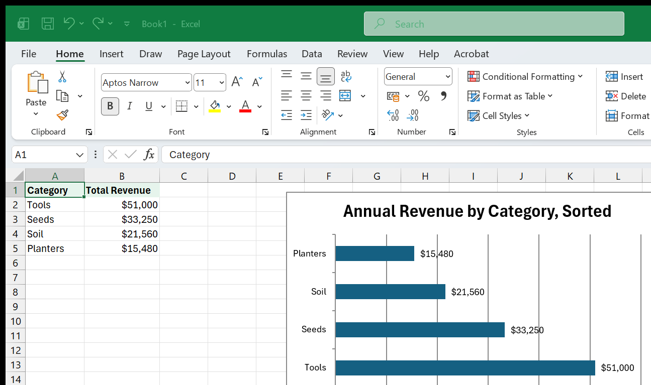
In a bar chart comparing categories (not time periods), sort the bars from longest to shortest. This is not a chart setting – you sort the underlying data. If the source table has products in rows, sort that column descending by the value column before creating the chart. A sorted bar chart is dramatically easier to read than an unsorted one.
Common mistakes
- Too many categories. A clustered column chart with fifteen categories and four series per category has sixty bars – unreadable. Combine small categories into “Other,” or switch to a different chart type.
- Starting the axis above zero. Excel sometimes adjusts the axis minimum for readability. For bar/column charts, this is almost always misleading because it exaggerates differences. Right-click the vertical axis, choose Format Axis, and set the minimum to 0.
- 3-D columns. The 3-D effect adds no information and makes values harder to judge because perspective distorts bar lengths. Stick with 2-D.
4. Line Charts and Trends
Goal: Use line charts for time-series data, add markers and trendlines, and know when a line chart is the wrong choice.
A line chart connects data points with a continuous line, making it the natural choice for data that unfolds over time. Where a column chart emphasizes individual values, a line chart emphasizes direction – is the number going up, going down, or holding steady?
Building a basic line chart
Select the entire Greenleaf Sales table (A1:E13) and go to Insert > Line > Line with Markers. Excel draws four lines – one per product category – each connecting twelve monthly data points. The x-axis shows months; the y-axis shows revenue. The legend identifies which color is which category.
“Line with Markers” adds a small dot at each actual data point. This matters because a line between two points implies continuous data in between – but monthly revenue is measured once per month, not continuously. The markers make it clear where the real data points sit.
Multiple series: when it works, when it doesn’t
Four lines on one chart work fine when the lines are reasonably separated. In the Greenleaf data, Tools revenue is consistently highest and Seeds fluctuates with the season, so the lines stay distinct. But if two series track almost identically, their lines overlap and become unreadable. Solutions:
- Highlight one series. Make the important line thicker (3 pt) and bolder, and make the others thin (1 pt) and gray. Click any line to select the series, then right-click > Format Data Series > Line > set width and color.
- Small multiples. Instead of cramming four series onto one chart, create four small charts side by side, each showing one category. This is a powerful technique covered in Chapter 11.
Adding a trendline
A trendline shows the general direction of a series, smoothing out month-to-month noise. Right-click any data series line and choose Add Trendline. Excel opens the Format Trendline pane with several options:
- Linear – a straight line of best fit. Good for data that grows or shrinks at a roughly constant rate.
- Exponential – a curve for data that grows by a constant percentage (compound growth). Not appropriate for seasonal data like Greenleaf’s.
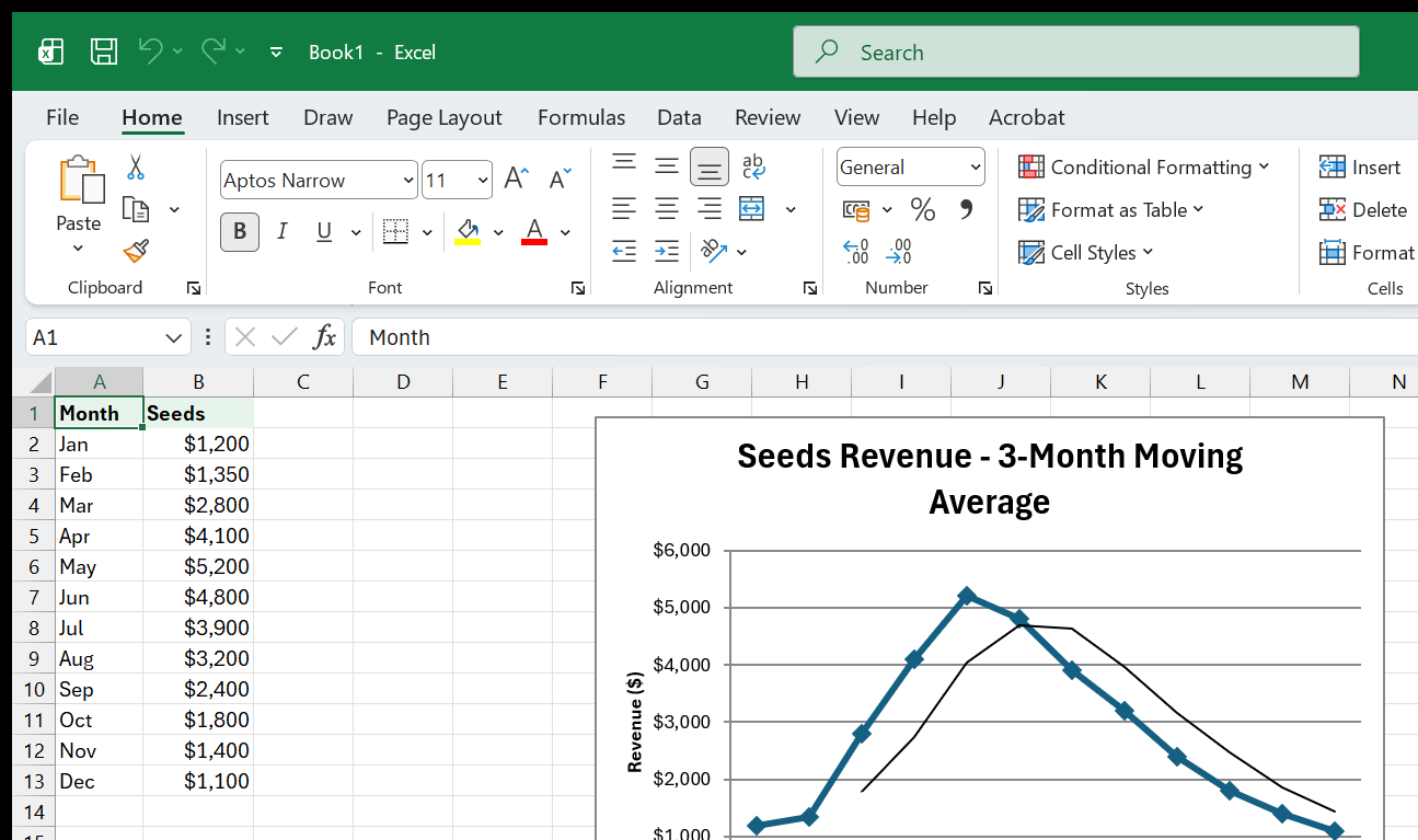
- Moving Average – smooths the line by averaging a rolling window of data points. Set the period (e.g., 3 for a three-month moving average). This is the best choice for seasonal data because it does not assume a straight-line direction.
- Polynomial – a curve with bends. Useful for data that rises then falls (or vice versa). Set the order to 2 for a single hump, 3 for an S-curve, etc.
To display the trendline’s equation or R-squared value on the chart, check the boxes at the bottom of the Format Trendline pane. The R-squared value (between 0 and 1) indicates how well the trendline fits the data: closer to 1 means a better fit.
Forecasting with a trendline
In the Format Trendline pane, the Forecast section lets you extend the trendline beyond your data. Enter a number of periods in “Forward” to project the trend into the future. This is a visual estimate, not a statistical model – it assumes the same pattern continues unchanged. But for a quick “where is this heading?” visual, it is useful.
When line charts go wrong
- Non-time-series categories. A line implies continuity between points. If the x-axis is product names or regions, the line between them is meaningless – use a column or bar chart instead.
- Too few data points. A line chart with three points is just two segments. You need at least five or six points before a line starts to reveal a meaningful shape.
- Irregular intervals. If data points are not evenly spaced in time (e.g., Jan, Mar, Sep, Dec), a standard line chart spaces them evenly on the axis anyway, which misrepresents the gaps. Use an XY (Scatter) chart instead – it plots by actual date value on a continuous axis.
Area charts: a close relative
An area chart is a line chart with the space below the line filled in. It emphasizes volume rather than direction. A stacked area chart fills areas on top of each other, showing both individual series and their cumulative total. Use area charts when you want to convey magnitude over time, but be aware that overlapping filled areas can obscure the lower series – stacked areas avoid this problem.
Practical exercise: Greenleaf seasonal trend
Try this with the Greenleaf data:
- Select the Month column and the Seeds column (A1:A13 and B1:B13 – hold
Ctrlto select non-adjacent ranges). - Insert a Line with Markers chart.
- Right-click the line > Add Trendline > choose Moving Average with a period of 3.
- The trendline smooths the seasonal bump, showing the underlying shape: seed sales rise from January through May, then decline through December.
- Now add the Tools series: click the chart, go to Chart Design > Select Data > Add. Set the Series name to the Tools header cell and the Series values to the Tools data range. A second line appears.
- Format the Seeds line as 2.5 pt teal; format the Tools line as 1.5 pt gray. This visual hierarchy tells the reader that Seeds is the focus.
The result is a clean two-series line chart with a trendline, ready for a report or dashboard. The exercise touches on data selection, trendlines, adding a series after the fact, and formatting with purpose – all skills that come up repeatedly.
5. Pie and Doughnut Charts
Goal: Know the narrow situation where a pie chart is appropriate, the many situations where it is not, and how doughnut charts compare.
Pie charts are the most commonly created chart type in Excel – and the most commonly misused. A pie shows parts of a whole: each slice is a proportion of a single total. That is the only thing a pie chart does. If your data is not “parts of one total that sum to 100%,” a pie chart is the wrong choice.
When a pie chart works
A pie chart works when:
- You have one data series (not multiple series over time).
- The slices represent parts of a meaningful whole (e.g., market share, budget allocation, category mix for a single month).
- You have six or fewer slices. More than six and the slices become too thin to compare visually.
- No two slices are nearly the same size. The human eye is poor at comparing angles – if two slices are 23% and 25%, nobody can tell which is larger without reading the label.
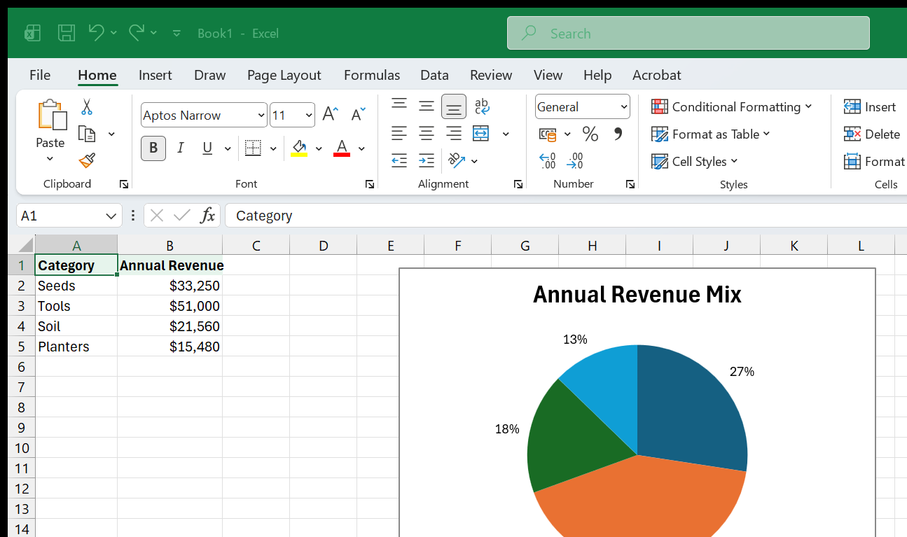
For Greenleaf, a pie chart of April’s revenue split across Seeds, Tools, Soil, and Planters is a valid use: four slices that sum to one month’s total.
Building a pie chart
You need a one-row or one-column data selection with a matching set of
labels. For April (row 5 in the Sales table), select B1:E1 (the category
headers) then hold Ctrl and select B5:E5 (April’s values). Go to Insert >
Pie > 2-D Pie. Excel draws four slices.
Alternatively, compute totals and chart those. For instance, if you create a summary row:
=SUM(Sales[Seeds])That sums all twelve months of seed revenue. Put similar SUM formulas for each category, then chart those four totals as a pie.
Adding labels and percentages
Right-click any slice > Add Data Labels. Then right-click the labels > Format Data Labels and check Percentage (uncheck Value if you want percentages only). Position them “Outside End” for readability. The percentage tells the story better than the raw number in a pie chart, because the whole point is proportion.
Exploding a slice
To pull one slice away from the pie for emphasis, click the pie to select all slices, then click the specific slice once more to select only it, and drag it outward. Alternatively, right-click a single slice > Format Data Point > set the Point Explosion percentage. Use this sparingly – exploding every slice defeats the purpose and just makes the chart look like it fell apart.
The doughnut chart
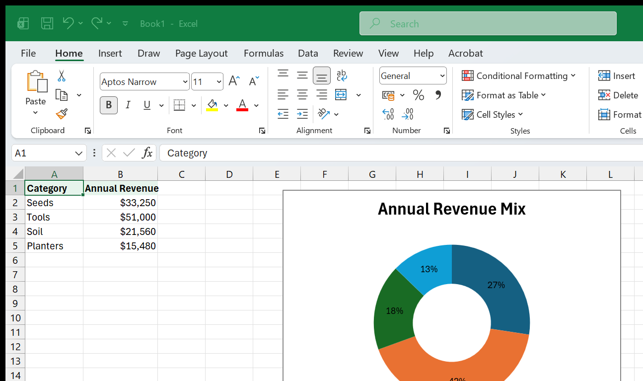
A doughnut chart is a pie with a hole in the middle. It looks identical functionally, but the hole can hold a text box with a summary number or label – a technique popular in dashboards. Insert one via Insert > Pie > Doughnut.
Doughnuts can also show multiple rings (one per data series), but this rapidly becomes unreadable. Stick to a single ring.
When to avoid pie charts
- Comparing across time. Two pie charts side by side (January vs. July) are nearly impossible to compare visually. Use a clustered column chart instead.
- Too many slices. Seven or more slices turn into a kaleidoscope. Group the smallest into “Other” or switch to a horizontal bar chart sorted by value.
- Comparing similar values. If three slices are 31%, 34%, and 35%, no one can visually rank them. A bar chart makes the difference obvious.
- Showing change. Pie charts are static snapshots. If you need to show how proportions shift over time, use a 100% stacked column chart (see Chapter 3).
The data-visualization community has a saying: “Friends don’t let friends make pie charts.” That is a little extreme – pie charts do have a place – but it is a useful reminder to always ask whether a bar chart would tell the same story more clearly.
6. Scatter and Bubble Charts
Goal: Use scatter plots to show correlation between two variables, and bubble charts to add a third dimension.
Every chart type covered so far uses categories on one axis (months, products) and values on the other. A scatter chart is different: both axes are numeric values. Each dot represents one data point plotted by its x value and its y value. Scatter charts answer a fundamentally different question: “Is there a relationship between these two numbers?”
When to use a scatter chart
- Investigating whether spending on ads predicts revenue.
- Checking whether study hours correlate with test scores.
- Exploring whether temperature affects daily sales.
- Any time you have paired numeric measurements and want to see if they move together.
Building a scatter chart with the Greenleaf data
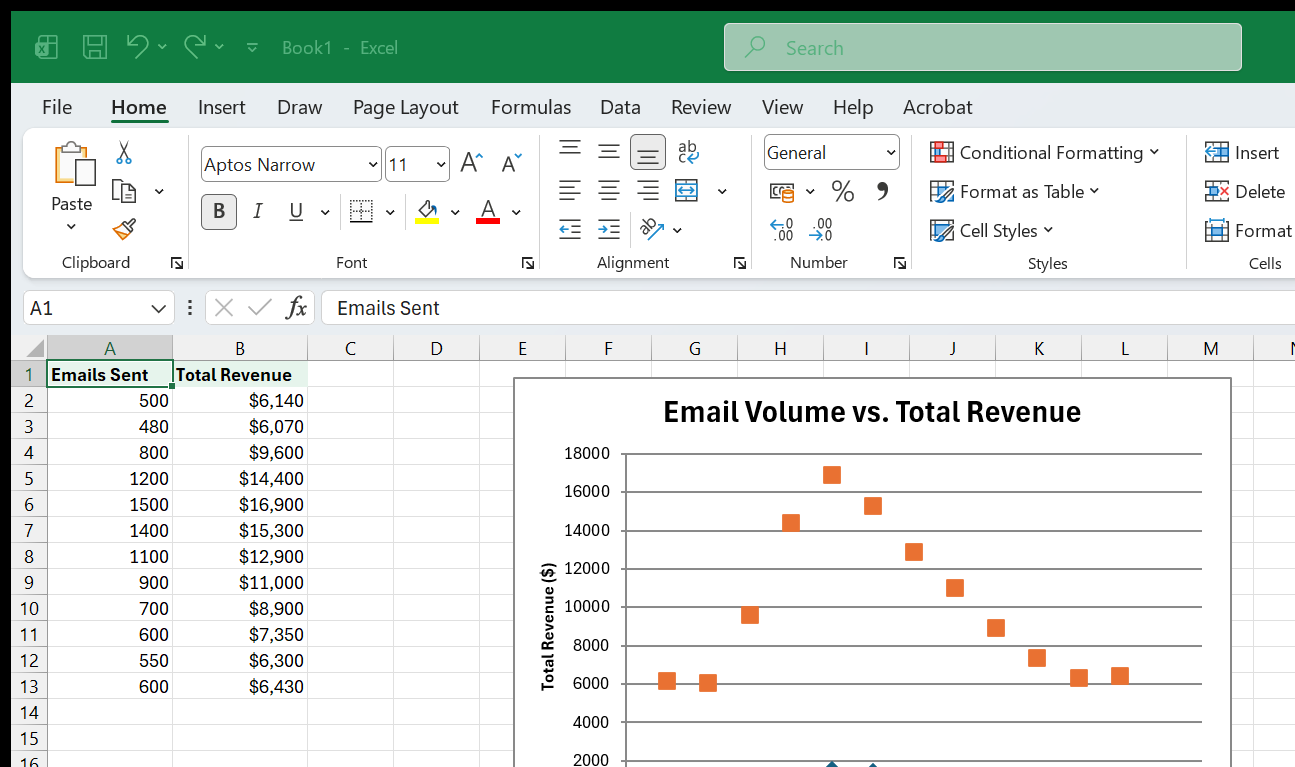
Suppose Greenleaf tracked not only revenue but also the number of marketing emails sent each month. Add a column F (header “Emails Sent”) with these values: 500, 480, 800, 1200, 1500, 1400, 1100, 900, 700, 600, 550, 600.
To see whether more emails correlate with higher total revenue, first compute total monthly revenue in column G:
=SUM(B2:E2)Copy that formula down for all twelve months. Now select F1:G13 (Emails Sent and Total Revenue, including headers) and go to Insert > Scatter > Scatter with Only Markers. Each month becomes a dot; the x-axis shows emails sent and the y-axis shows total revenue.
If the dots trend upward from left to right, there is a positive correlation. If they scatter randomly, there is no clear relationship. In Greenleaf’s case, the dots should trend upward – months with more emails tend to have higher revenue – though correlation does not prove causation.
Adding a trendline to a scatter chart
Right-click any dot and choose Add Trendline > Linear. The straight line shows the general direction. Check Display R-squared value on chart to see how tight the relationship is. An R-squared above 0.7 suggests a strong linear correlation; below 0.3 is weak.
Labeling data points
By default, scatter chart dots are anonymous – you cannot tell which dot is which month. To fix this:
- Click any dot to select the data series.
- Right-click > Add Data Labels.
- Right-click the labels > Format Data Labels.
- Uncheck Y Value, check Value From Cells, and select the Month column (A2:A13).
Now each dot is labeled with its month name, making the chart far more informative.
Bubble charts
A bubble chart is a scatter chart where each dot’s size encodes a third variable. In Greenleaf’s case, you could make the dot size represent the number of transactions (a proxy for customer count), so the chart shows emails sent (x), total revenue (y), and transaction volume (bubble size) simultaneously.
To create one: select three columns of data (x values, y values, and size values, each with a header), then Insert > Scatter > Bubble. Excel uses the third column to scale the dot diameter.
Bubble charts pack a lot of information into a small space, but they are hard to read precisely – the human eye is not great at comparing circle areas. Use them for exploration and presentation, not for reading exact values.
Common scatter/bubble pitfalls
- Axes not starting at zero. Unlike bar charts, scatter charts often benefit from axes that do not start at zero, because the data may cluster in a narrow range. Let Excel’s auto-scaling work unless it distorts the picture.
- Overplotting. When many points land on top of each other, the chart looks like a blob. Reduce marker size, add transparency (Format Data Series > Marker > Fill > set transparency to 30–50%), or switch to a density-style visualization in a more advanced tool.
- Connecting scatter points with lines. A connected scatter is a legitimate chart type (it shows a trajectory over time), but it is easy to confuse with a standard line chart. Only connect scatter dots when the sequence matters.
Practical exercise: correlation scatter
Build this chart with the Greenleaf data to practice scatter plots:
- In column F, add the header “Emails Sent” and these monthly values: 500, 480, 800, 1200, 1500, 1400, 1100, 900, 700, 600, 550, 600.
- In column G, add the header “Total Revenue” and enter this formula in G2:
=SUM(B2:E2)- Copy the formula down to G13.
- Select F1:G13 and insert a Scatter with Only Markers chart.
- Right-click any dot > Add Trendline > Linear. Check “Display R-squared value on chart.”
- Right-click the data labels > Format Data Labels > check “Value From Cells” and select A2:A13 (the month names). Uncheck Y Value.
- Set the chart title to “Email Volume vs. Total Revenue.”
You now have a labeled scatter plot with a trendline and R-squared value, showing the relationship between marketing effort and revenue. This is exactly the kind of chart an analyst might include in a monthly marketing review.
7. Combo Charts and Dual Axes
Goal: Mix chart types (columns + line) on a single chart and add a secondary axis for values on different scales.
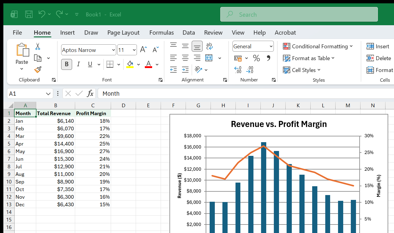
Sometimes one chart type is not enough. A classic example: you want to show Greenleaf’s monthly total revenue as columns and the profit margin percentage as a line, both on the same chart. The revenue numbers are in the thousands; the margin percentages are between 0 and 100. Plotting both on the same axis squashes the margin line into a flat stripe at the bottom. The solution is a combo chart with a secondary axis.
Building a combo chart from scratch
- Prepare the data. In the Greenleaf workbook, add a column for Total Revenue and another for Profit Margin. Assume:
=SUM(B2:E2)And assume a Profit Margin column (column H) with values like 18%, 17%, 22%, 25%, 27%, 24%, 21%, 20%, 19%, 17%, 16%, 15%.
- Select the Month column, the Total Revenue column, and the Profit Margin
column (use
Ctrl+Clickto select non-adjacent columns including their headers). - Go to Insert > Combo (the icon with a column and a line together, at the end of the Charts group) > Create Custom Combo Chart.
- In the dialog, set Total Revenue to Clustered Column and Profit Margin to Line. Check the Secondary Axis box next to Profit Margin.
- Click OK.
Excel creates a chart with columns for revenue (left axis, in dollars) and a line for margin (right axis, in percentages). The two scales are independent, so neither series gets squashed.
When combo charts are appropriate
- Two related series on different scales. Revenue and margin. Units sold and average price. Temperature and rainfall. The combo chart lets both series be readable.
- Emphasizing a different story per series. Columns for absolute values, a line for a rate or trend layered on top.
When combo charts mislead
A dual-axis chart can be dangerous. Because the two axes are independently scaled, you can make any two lines appear to cross, converge, or diverge simply by changing the axis range. Readers may unconsciously interpret the visual intersection of a column and a line as meaningful – but it is an artifact of the axis scales, not the data.
Mitigations:
- Label both axes clearly, including units (e.g., “Revenue ($)” on the left, “Margin (%)” on the right).
- Do not let the axes imply a false relationship. If the left axis goes from 0 to 20,000 and the right axis goes from 0 to 100%, the midpoints (10,000 and 50%) are visually aligned but have no meaningful connection.
- Consider two separate charts stacked vertically as an alternative. They share the same x-axis (months) but each has its own clearly labeled y-axis, with no risk of visual false equivalence.
Changing a series to a secondary axis after the fact
If you already have a chart and want to move one series to a secondary axis, click on the data series in the chart to select it, then right-click > Format Data Series > Series Options > Secondary Axis. The chart redraws with a second y-axis on the right side.
Changing one series to a different chart type
Similarly, right-click a data series > Change Series Chart Type. Excel opens the combo chart dialog where you can reassign chart types per series. This is the same dialog you saw during creation – you can revisit it at any time.
The built-in combo presets
Excel offers three pre-built combo chart layouts under Insert > Combo:
- Clustered Column – Line – columns for the first series, a line for the second, same axis.
- Clustered Column – Line on Secondary Axis – the most common layout, described above.
- Stacked Area – Clustered Column – less common, useful for showing a cumulative background with individual category bars in front.
For most work, the second preset (column + line on secondary axis) is the one you will reach for.
8. Formatting Charts for Clarity
Goal: Turn a default chart into a clear, professional visual by controlling titles, labels, gridlines, colors, and fonts.
Excel’s default charts are functional but rarely presentation-ready. The colors may not match your brand, the title says “Chart Title” (literally), and the gridlines may be distracting. This chapter walks through the formatting decisions that matter most, in the order you should make them.
1. Title
Click the default “Chart Title” text and type a real title. A good chart title states the insight, not just the topic:
- Weak: “Monthly Revenue”
- Better: “Revenue Peaks in May, Led by Seeds and Tools”
The title should pass the five-second test: a reader who sees only the title and the chart should understand the point immediately.
To format the title, right-click it and choose Format Chart Title. Set the font to match your document (Calibri or Aptos at 14–16 pt is a safe default). Bold is fine; italics are harder to read on screens. Align it left for a modern look (drag it to the left side of the chart area), or leave it centered for traditional reports.
2. Axis titles
Add axis titles from the Chart Design tab > Add Chart Element > Axis Titles. The vertical axis title should name the unit (“Revenue ($)” or “Units Sold”). The horizontal axis title is often unnecessary if the categories (months, products) are self-explanatory. Remove it if it just says “Month” – the axis labels already say Jan, Feb, Mar.
3. Legend
The legend identifies series by color. Position it at the top or bottom of the chart (Chart Design > Add Chart Element > Legend > Top/Bottom) rather than the right side, which steals horizontal space from the data area. If there is only one data series, delete the legend entirely – it adds no information.
For a chart with two or three series, consider labeling the series directly on the chart (click the end of a line, add a text box with the series name) and removing the legend. Direct labels eliminate the back-and-forth eye movement between chart and legend.
4. Gridlines
Gridlines help readers estimate values, but too many gridlines turn the chart into a cage. The defaults are usually fine for the horizontal axis (major gridlines only). Remove minor gridlines unless precision matters. To change gridlines: Chart Design > Add Chart Element > Gridlines.
For a cleaner look, make gridlines light gray (not black) and thin. Or remove them entirely if you have data labels on the bars – the labels make gridlines redundant.
5. Colors
Excel assigns colors from your workbook’s theme. To change a single series’ color, click the series, then right-click > Format Data Series > Fill. To change the overall color scheme, go to Page Layout > Colors and pick a theme palette, or define a custom one.
Color guidelines:
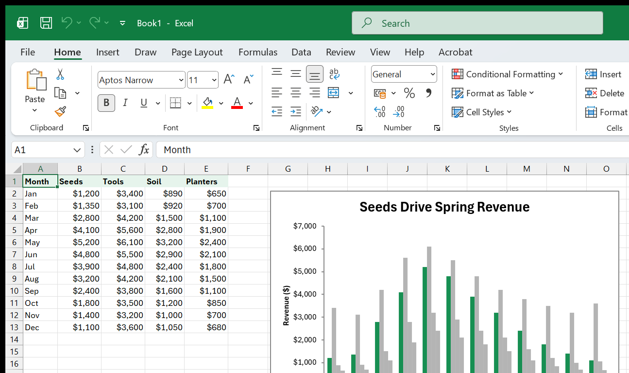
- Use one accent color for the main point, with gray for everything else. If Seeds is the story, make Seeds teal and the other three series light gray.
- Avoid red-green combinations. About 8% of men have red-green color vision deficiency. Use blue-orange or teal-amber instead.
- Be consistent. If Seeds is teal in one chart, it should be teal in every chart in the workbook.
6. Number format on axes
Right-click an axis > Format Axis > Number. Set the format to match your data: currency for dollars, percentage for rates, “0” for whole numbers. Use thousands separators for large numbers. For very large values, divide by 1,000 and label the axis “Revenue ($000s)” to avoid cluttered labels like “$12,000.”
7. Data labels (selectively)
Data labels on every bar in a twelve-month, four-series chart create visual noise. Use them selectively:
- On a single-series chart, add data labels and remove the axis.
- On a multi-series chart, add data labels only to the series that matters most (click that series first, then right-click > Add Data Labels).
- On a line chart, add labels only at the start and end points.
8. Chart border and background
The default chart background is white and the border is a thin gray line. For reports embedded in a white document, remove the border (Format Chart Area > Border > No Line) so the chart blends in. For presentations, a subtle fill or border can help the chart stand out against a colored slide background.
Formatting checklist
Before calling a chart done, run through this list:
- Title states the insight, not just the topic.
- Axis labels include units.
- Legend is positioned at top/bottom or replaced with direct labels.
- Gridlines are light and minimal (or removed if labels are present).
- Colors are consistent, accessible, and purposeful.
- Number formats on axes match the data.
- No 3-D effects, no unnecessary borders, no chart junk.
9. Sparklines
Goal: Add tiny in-cell charts that show a trend right next to the data, without taking up chart-sized space.
A sparkline is a miniature chart that lives inside a single cell. Invented by Edward Tufte (the data-visualization author whose principles we will use in Chapter 11), sparklines are designed to be “data-intense, design-simple, word-sized graphics.” They are perfect for dashboards and summary tables where you want to show a trend alongside the numbers without creating a full chart for every row.
Three sparkline types
Excel offers three sparkline types, all on the Insert tab in the Sparklines group:
- Line – a miniature line chart. Best for showing trend direction over time. This is the most common type.
- Column – tiny vertical bars. Best for comparing individual values within the series (like monthly totals where you care about relative height, not just direction).
- Win/Loss – bars of uniform height, pointing up or down. Best for binary outcomes: did this month beat budget (up) or miss it (down)? Was the change positive (up) or negative (down)?
Creating sparklines
Using the Greenleaf data:
- Click cell F2 (an empty cell next to the first row of data).
- Go to Insert > Line (in the Sparklines group).
- In the dialog, set Data Range to B2:E2 (that row’s four category values) or B2:B13 (all months for one category, depending on what you want to show). For a trend across months, use B2:B13 for Seeds.
- Set Location Range to F2.
- Click OK. A tiny line chart appears in F2.
To create sparklines for all four categories at once, set the Data Range to B2:B13 and the Location Range to F2, then repeat for each category – or select all source ranges and location cells in one operation.
Actually, the faster approach: type sparklines for all rows at once. Click
F2, then Insert > Line, set Data Range to B2:E2 (across categories for
January), and Location Range to F2. Excel inserts one sparkline. Then
select F2, copy it (Ctrl+C), select F3:F13, and paste (Ctrl+V). Each
pasted sparkline adjusts its data range to the corresponding row, just like
a regular formula.
Sparkline formatting
When a sparkline cell is selected, the Sparkline tab appears on the ribbon (in some versions it is called “Sparkline Design”). Key options:
- High Point / Low Point – color the highest and lowest values differently, making them pop visually. Check the boxes in the Show group and pick colors in the Style group.
- First Point / Last Point – emphasize the start and end of the series, useful for showing where a trend started and where it is now.
- Negative Points – color negative values in a contrasting color (red, by convention).
- Axis settings – click the Axis dropdown. By default, each sparkline scales to its own min and max. To make all sparklines in a group share the same scale (so their heights are comparable), select “Same for All Sparklines” under both Minimum and Maximum. This is important – without a shared axis, a sparkline for a $500 category and a $5,000 category look the same, which is misleading.
- Sparkline Color and Weight – change the line color and thickness from the Style group. Thin lines (0.75 pt) in a muted color work best; thick bright lines overwhelm the cell.
Sparklines and Tables
If your data is in an Excel Table (as recommended for the Greenleaf dataset), sparklines work seamlessly: add a new row to the Table and the sparkline column extends automatically. This makes sparklines ideal for live dashboards that grow over time.
When to use sparklines vs. full charts
- Sparklines for quick trend context next to the data (“is this going up or down?”).
- Full charts for detailed analysis, comparison, or presentation.
Sparklines and full charts complement each other. A summary table with sparklines gives the overview; clicking through to a full chart sheet provides the detail. For more on combining them, see the Dashboards & Reporting topic.
Deleting sparklines
Sparklines are not regular cell content – pressing Delete clears the cell but not the sparkline. To remove a sparkline, select the cell, go to the Sparkline tab, and click Clear in the Group section. To clear an entire group at once, click Clear > Clear Selected Sparkline Group.
Practical exercise: sparkline summary row
Build a sparkline summary for the Greenleaf data:
- In cell G1, type the header “Trend.”
- Click G2. Go to Insert > Line (Sparklines group).
- Set Data Range to B2:E2 and Location Range to G2. Click OK. A tiny line appears showing January’s revenue across the four categories.
- With G2 selected, go to the Sparkline tab. Check High Point and set its color to teal. Check Low Point and set its color to red.
- Copy G2 down to G13. Each row now has its own sparkline showing the category mix for that month.
- To make the sparklines comparable across rows, select G2:G13, go to the Sparkline tab > Axis dropdown, and under Vertical Axis Minimum Value choose “Same for All Sparklines.” Do the same for Maximum Value.
Now every sparkline shares the same vertical scale. You can instantly see that May (row 6) has the tallest peaks and December (row 13) has the flattest profile – information that would require scanning sixteen numbers without the sparklines.
For a different perspective, try column sparklines instead: select G2:G13, go to the Sparkline tab, and click Column in the Type group. The sparklines redraw as tiny bar charts. Column sparklines make it easier to compare individual category values; line sparklines are better for seeing the overall shape.
10. Conditional Formatting as Visualization
Goal: Use Excel’s built-in conditional formatting tools – data bars, color scales, and icon sets – to add visual meaning directly to cells without creating a chart.
Not every visualization needs to be a chart. Conditional formatting turns the cells themselves into a visual layer – no separate chart object, no extra space, no need to keep a chart and its data in sync. For quick at-a-glance analysis, it is often the fastest option.
Data bars
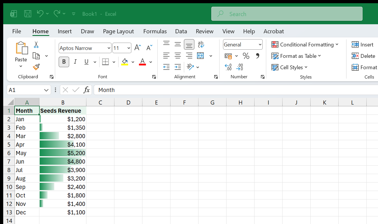
Data bars fill each cell with a horizontal bar whose length is proportional to the cell’s value. The largest value gets a full-width bar; smaller values get shorter bars. The effect is a built-in horizontal bar chart embedded in the column.
To apply:
- Select the range (e.g., B2:B13 for Seeds revenue).
- Go to Home > Conditional Formatting > Data Bars.
- Pick a color. The “Gradient Fill” options look modern; “Solid Fill” is cleaner for printing.
To customize: Home > Conditional Formatting > Manage Rules > select the data bar rule > Edit Rule. Key options:
- Minimum and Maximum – by default, Excel uses the smallest and largest values in the range. You can override these with fixed numbers (useful when comparing across columns – set the same min and max for all four category columns so the bar lengths are comparable).
- Bar Direction – left-to-right is the default and almost always correct.
- Negative Value and Axis – if your data includes negative numbers, Excel shows negative bars going left from a midpoint axis and positive bars going right. You can change the axis color and position.
- Show Bar Only – check this to hide the numbers and show only the bars, turning the column into a pure visual. Uncheck it (the default) to keep both the number and the bar visible.
Color scales
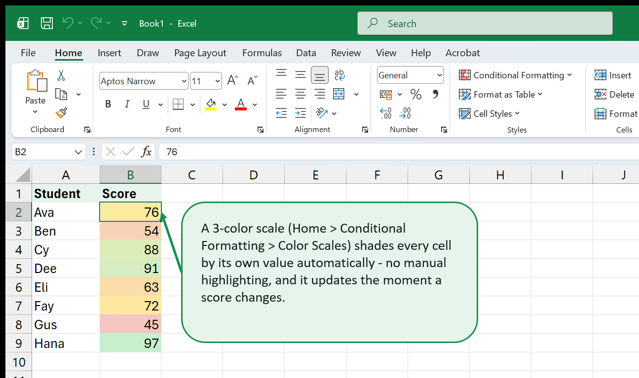
Color scales shade each cell’s background on a gradient from one color to another (or three colors for a diverging scale). The classic two-color scale runs from red (low) to green (high), though that combination is problematic for color-blind readers. Better options:
- White to blue (low to high) – clean, accessible.
- Red to white to green (low-mid-high) – classic diverging scale, but consider red-white-blue for accessibility.
To apply: Home > Conditional Formatting > Color Scales > pick a preset. To customize: Manage Rules > Edit Rule, where you can set the midpoint, choose colors, and base the scale on percentiles instead of raw values.
Color scales work best on dense tables where you want to spot hot spots and cold spots at a glance – like a heatmap. They are less useful for precise comparison (you cannot read exact values from shades of blue).
Icon sets
Icon sets place a small icon in each cell – arrows (up/sideways/down), traffic lights (green/yellow/red), stars, flags, or check marks. Excel divides the value range into groups (by percentile or value thresholds) and assigns an icon to each group.
To apply: Home > Conditional Formatting > Icon Sets > pick a set.
Useful combinations:
- Three arrows (up/sideways/down) for growth rates – positive, flat, negative.
- Three traffic lights for status indicators – on track, at risk, off track.
- Five stars for ratings or scores.
To customize thresholds: Manage Rules > Edit Rule. You can change the breakpoints from percentiles to specific values (e.g., green arrow if growth > 5%, sideways arrow if between -5% and 5%, red arrow if < -5%). Check Show Icon Only to hide the number and display just the icon – useful for summary columns.
Combining conditional formats
You can layer multiple conditional formats on the same range. For example:
- Data bars to show magnitude.
- An icon set in an adjacent column to show whether the change from last month was positive or negative.
Or use color scales on the main data and data bars on a “change” column. The key is restraint – two visual layers are informative; three become noise.
Conditional formatting vs. charts
| Feature | Conditional Formatting | Chart |
|---|---|---|
| Space | None – lives in the cells | Needs its own area |
| Updates | Instant as data changes | Instant if linked to source |
| Precision | Exact numbers still visible | Numbers rounded or hidden |
| Comparison | Within one column/range | Across multiple series |
| Presentation | Informal, analytical | Formal, presentation-ready |
Use conditional formatting for working analysis and dashboards. Use charts for reports, presentations, and detailed visual storytelling. For a deeper dive, see the Conditional Formatting topic page.
11. Building a Dashboard-Ready Chart
Goal: Apply design principles to create charts that are clean enough for a dashboard – no chart junk, no unnecessary decoration, maximum data-ink ratio.
Edward Tufte, in his classic book The Visual Display of Quantitative Information, introduced the concept of data-ink ratio: the proportion of a chart’s ink that is dedicated to showing data (versus decoration, borders, backgrounds, and other non-data elements). A high data-ink ratio means a clean, efficient chart. A low one means clutter.
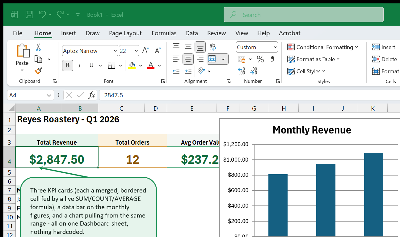
This chapter takes a Greenleaf chart from default to dashboard-ready, removing everything that does not help the reader understand the data.
Step 1: Start with a clean chart type
Use a simple 2-D chart. No 3-D, no bevels, no shadows, no gradient fills on bars. These effects add zero information and make values harder to read. If your chart already has 3-D effects, right-click it > Change Chart Type and select the 2-D equivalent.
Step 2: Remove chart junk
Chart junk is anything that does not convey data:
- Background fill – set it to “No Fill” so the chart blends with the dashboard background.
- Chart border – remove it (Format Chart Area > Border > No Line).
- Gridlines – remove them or make them very faint (light gray, thin). If you keep gridlines, use only major horizontal gridlines.
- Axis tick marks – remove them (Format Axis > Tick Marks > None). The grid already aligns values to the axis.
- Extra axis labels – if data labels are present, the axis is redundant. Remove whichever one adds less value.
Step 3: Use color with purpose
A dashboard chart should not look like a box of crayons. Use:
- One accent color for the primary series or data point that carries the message.
- Gray for all supporting series – they provide context but should not compete for attention.
- A highlight color (e.g., red or orange) for outliers or data points that need action.
For Greenleaf’s monthly revenue by category, if the dashboard’s story is “Seeds drive the seasonal peak,” color Seeds teal and make Tools, Soil, and Planters three shades of light gray.
Step 4: Simplify the title
A dashboard chart’s title should be short and specific. “Seeds Drive Spring Revenue” is better than “Monthly Revenue by Category (Jan–Dec).” If the dashboard has a section header that provides context, the chart title can be even shorter: “Seeds vs. Other Categories.”
Step 5: Align charts on a grid
When placing multiple charts on a dashboard sheet:
- Make all charts the same height.
- Align their left edges.
- Use consistent axis ranges across charts that show the same variable (so that a bar of the same length always means the same value).
- Leave consistent spacing between charts.
Hold Alt while dragging a chart to snap it to cell boundaries. This is
the simplest way to keep charts aligned on a grid without measuring pixels.
Step 6: Consider small multiples
Instead of one chart with four overlapping series, create four identical charts – one per product category – arranged in a 2x2 grid. Each chart shows only one line or bar series, with the same axis scale. The reader’s eye compares position across the four panels without the confusion of overlapping colors.
Small multiples are more work to build in Excel (you create four charts manually), but the clarity gain is enormous. They are one of Tufte’s most celebrated ideas.
Step 7: Test the five-second rule
Show the chart to someone for five seconds, then take it away. Ask them what the chart showed. If they got the main message, the chart works. If they cannot articulate it, the chart needs a clearer title, a more purposeful color scheme, or a simpler layout.
Step 8: Print and screen check
Charts that look fine on a bright monitor may not survive printing. Check:
- Black and white. If your chart is printed on a monochrome printer (or by someone who prints in grayscale to save ink), can you still tell the series apart? Use pattern fills (hatching) or distinctly different brightness levels in addition to color.
- Small size. A dashboard chart is often small. Zoom out to 75% and see if the labels are still readable. If not, increase font sizes or simplify.
Step 9: Use named ranges or Tables for dynamic chart data
Charts built on raw cell ranges break when you insert or delete rows. Charts
built on Excel Table columns (structured references) or named ranges resize
automatically. If your chart’s source data is a Table named Sales, any
new row you add to Sales appears in the chart with no manual adjustment.
To check or change a chart’s data source, click the chart and go to Chart
Design > Select Data. The “Chart data range” box at the top shows the
current source. If it shows something like Sheet1!$A$1:$E$13, that is a
fixed range – consider converting the source to a Table first (select the
data, Ctrl+T), then recreate the chart from the Table. The new chart’s
data range will reference the Table’s name, and future rows are included
automatically.
Step 10: Add interactivity with slicers (for PivotCharts)
If your chart is based on a PivotTable (a PivotChart), you can add slicers that let a viewer filter the chart interactively. For example, a slicer for “Product Category” lets the viewer click “Seeds” to see only seed revenue, or click all four categories to see everything.
To add a slicer: click inside the PivotTable, go to PivotTable Analyze > Insert Slicer, and check the field(s) you want. Position the slicer next to the chart on the dashboard. Slicers are covered in depth in the PivotTables topic and the Pivot Tables from Zero ebook.
The dashboard design checklist
- 2-D chart types only.
- No background fill or border on the chart area.
- Gridlines minimal or removed.
- One accent color, gray for context.
- Title states the insight.
- All charts on the sheet share a grid alignment.
- Same-variable axes use the same scale.
- Chart data sourced from Tables or named ranges (not fixed cell ranges).
- Passes the five-second rule.
Practical exercise: dashboard from scratch
Build a mini dashboard for Greenleaf on a new sheet:
- Create a new sheet called “Dashboard.”
- On the Sales sheet, create a summary table: total annual revenue per category. Use formulas like:
=SUM(Sales[Seeds])- On the Dashboard sheet, insert a Clustered Bar chart from the summary totals. Sort the bars longest to shortest (sort the summary data descending by total before charting).
- Insert a Line with Markers chart showing monthly total revenue (sum of all categories per month) over the twelve months.
- Apply the formatting principles from this chapter: remove borders, use one accent color, add concise insight-based titles, align both charts on a grid.
- Add sparklines in a summary table below the charts showing each category’s monthly trend.
The result is a one-sheet dashboard with three complementary views: a bar chart for category ranking, a line chart for the overall time trend, and sparklines for per-category trends. This is the kind of dashboard you can build in under thirty minutes once the principles are internalized.
For a deeper look at building full interactive dashboards with slicers and PivotCharts, see the Dashboards & Reporting topic page and the Excel Intermediate Skills ebook.
12. Where to Go Next
Goal: Connect the charting skills you have learned to the rest of the ExcelBack learning path.
You now have a solid foundation in Excel charts and data visualization – the chart types that cover most real work, the formatting habits that make them clear, and the design principles that keep them honest. Here is where to go from here, depending on what you need.
Deepen your chart skills
- Charts & Visualization – the ExcelBack topic hub for charts. Subtopics cover waterfall charts, map charts, stock charts, and other specialized types not covered in this beginner guide.
- Dashboards & Reporting – building full interactive dashboards with slicers, PivotCharts, and layout techniques.
- Conditional Formatting – more advanced rules, formulas-based formatting, and real-world patterns.
Build the skills that feed your charts
Charts are only as good as the data behind them. These resources help you get data into shape:
- Excel for Beginners – if you skipped straight to charts, this free ebook covers the foundation: formulas, functions, tables, and data entry.
- Formulas & Functions – the topic hub for every formula category: lookups, logic, text, dates, math.
- Data Cleaning – removing duplicates, fixing text case, handling blanks, and preparing data for analysis.
- Sorting, Filtering & Views – getting your data into the right order and subset before charting.
Go deeper with PivotTables and Power Query
- Pivot Tables from Zero – a free ebook that teaches PivotTables from scratch. PivotTables are the fastest way to summarize data for charting (a PivotChart is a chart connected to a PivotTable, and it updates automatically when you rearrange the pivot).
- PivotTables – the topic hub with subtopics on grouping, calculated fields, slicers, and PivotCharts.
- Power Query – the full topic hub.
Formulas that pair with charts
Several functions come up repeatedly in chart-building workflows:
- SUM, AVERAGE, MIN, MAX – the core aggregation functions for preparing chart data. See the Formulas & Functions topic.
- IF and IFS – for computing derived series (e.g., “above target” vs. “below target”) that color-code chart bars. See Formulas & Functions.
- TEXT – for formatting axis labels and data labels with custom number formats. Useful in combo chart titles that reference cell values.
- XLOOKUP – for pulling values from lookup tables into chart data ranges. See the XLOOKUP & VLOOKUP Field Guide.
Keyboard shortcuts for chart work
A few shortcuts covered in this book are worth memorizing:
| Shortcut | Action |
|---|---|
Alt+F1 |
Insert a default chart on the current sheet |
F11 |
Insert a default chart on a new chart sheet |
Ctrl+1 |
Open Format dialog for the selected chart element |
Arrow keys |
Cycle through chart elements when a chart is selected |
Delete |
Remove the selected chart element |
Ctrl+Shift+End |
Select from current cell to the last used cell (for quick data selection) |
For a comprehensive shortcut reference, see the Excel Shortcuts Handbook.
ExcelBack tools
ExcelBack offers free online tools that complement your charting work:
- Formula Builder – build Excel formulas step by step with explanations.
- Formula Explainer – paste any formula and get a plain-English breakdown of what it does.
- Data Generator – generate sample datasets for practice – useful for experimenting with chart types.
- Reference Converter – convert between A1-style and R1C1-style references.
Keep learning
The best way to get better at data visualization is to practice with your own data. Take a report you produce regularly – a monthly sales summary, a budget tracker, a project status sheet – and rebuild its charts using the principles from this book. Remove the chart junk, choose colors with purpose, write a title that states the insight, and test the five-second rule.
Every chart you build is a chance to make someone’s decision a little easier and a little faster. That is the real point of data visualization – not decoration, but clarity.
Excel Charts & Data Visualization is a free ExcelBack ebook. For more guides, tools, and topic deep-dives, visit excelback.com.
That's the whole book. Keep the PDF for offline reading.
Download PDF


