

Conditional formatting is one of those features that sounds optional until you use it once - then you wonder how you ever read a spreadsheet without it. Instead of scanning column after column of raw numbers, you let Excel paint cells for you: green for good, red for bad, bars that grow with the value, icons that flag what needs attention. The data doesn’t change; the way you see it does.
This book walks through every conditional formatting tool Excel offers, from the one-click presets to the formula-based rules that let you format almost anything you can describe in words. We will use a single example dataset - a classroom gradebook - throughout, so every technique builds on something you already recognize. By the end, you will be able to highlight, shade, bar-chart, icon-flag, and formula-color any worksheet, and you will know how to manage, debug, and clean up the rules once they pile up.
Twelve short chapters. Work through them in order the first time - later chapters lean on concepts from earlier ones - then keep the PDF as a quick reference.
The example dataset. Every chapter uses the same gradebook. Set it up now so you can follow along:
| A | B | C | D | E | F | |
|---|---|---|---|---|---|---|
| 1 | Student | Quiz 1 | Quiz 2 | Midterm | Final | Average |
| 2 | Amara | 88 | 74 | 82 | 91 | 83.75 |
| 3 | Ben | 62 | 58 | 55 | 64 | 59.75 |
| 4 | Chloe | 95 | 92 | 97 | 89 | 93.25 |
| 5 | David | 71 | 77 | 68 | 73 | 72.25 |
| 6 | Elena | 84 | 81 | 79 | 86 | 82.50 |
| 7 | Faisal | 53 | 49 | 61 | 57 | 55.00 |
| 8 | Grace | 90 | 88 | 85 | 92 | 88.75 |
| 9 | Hiro | 76 | 70 | 74 | 78 | 74.50 |
| 10 | Ivy | 45 | 52 | 48 | 41 | 46.50 |
| 11 | Jake | 81 | 85 | 80 | 83 | 82.25 |
Column F holds averages calculated with a simple formula:
=AVERAGE(B2:E2)Copy that down through F11 for every student. This is your playground for the rest of the book.
1. What Conditional Formatting Does
Goal: Understand what conditional formatting is, why it matters, and where to find it in the ribbon.
Conditional formatting applies visual formatting - fill colors, font colors, borders, data bars, color scales, or icons - to cells automatically, based on rules you define. The word “conditional” is the key: the formatting only appears when a condition is true. If the value in a cell changes and no longer meets the condition, the formatting disappears on its own. You never have to remember to update it.
Why does this matter? Because human eyes are bad at scanning long columns of numbers but good at noticing color. A column of 500 numbers all in the same black text is a wall; that same column with the bottom 10% shaded red and the top 10% shaded green is a dashboard. The data hasn’t changed. The readability has transformed.
Where to find it
Conditional formatting lives on the Home tab of the ribbon, roughly in the middle, in the Styles group. The button is labeled Conditional Formatting and has a small dropdown arrow. Click it and you’ll see five categories of built-in rules, plus options for managing and clearing rules:
- Highlight Cell Rules - format cells based on their own value (greater than, less than, between, equal to, text that contains, dates, duplicates).
- Top/Bottom Rules - format cells based on their rank in the selected range (top 10, bottom 10, top 10%, bottom 10%, above average, below average).
- Data Bars - add a horizontal bar inside each cell, proportional to the cell’s value.
- Color Scales - shade cells on a gradient from one color to another (or through a midpoint color), based on where the value falls in the range.
- Icon Sets - place a small icon (arrow, traffic light, star, flag, etc.) in each cell based on the value’s relative position.
Below those five categories, two more items appear: New Rule (for creating custom or formula-based rules) and Manage Rules (for viewing, editing, reordering, and deleting every rule on the sheet). We will use both heavily starting in Chapter 7.
A first example
Select the range F2:F11 (the Average column in the gradebook), then click
Home > Conditional Formatting > Highlight Cell Rules > Less Than. In the
dialog that appears, type 60 and leave the format as “Light Red Fill with
Dark Red Text.” Click OK.
Every student whose average is below 60 - Ben (59.75), Faisal (55.00), and Ivy (46.50) - instantly shows a red background. Change Ivy’s Final score from 41 to 91 and watch: her average recalculates to 59.00 - still red. Change it to 95 and the average jumps to 60.00 - the red vanishes. That is conditional formatting in a sentence: the formatting tracks the data, live.
What you’ll see: The Average column lights up — every score below 60 appears in light-red fill with dark-red text. The rule fires the instant you press OK.
Conditional formatting vs. manual formatting
It’s worth drawing the line clearly. When you select a cell and click a fill color on the Home tab, that color stays until you manually remove it - even if the cell’s value changes from 100 to 0. That’s manual (or “static”) formatting. Conditional formatting, by contrast, is dynamic: Excel re-evaluates the rule every time the worksheet recalculates. If you find yourself manually recoloring cells every time data updates, conditional formatting is almost certainly the answer.
For a deeper look at the functions that power conditional formatting formulas later in this book, browse the function library on ExcelBack.
2. Highlight Cell Rules
Goal: Learn the six built-in “Highlight Cell Rules” presets and when to use each one.
Highlight Cell Rules are the simplest conditional formats: they test each cell’s own value against a threshold you provide and apply a fill/font format if the test passes. Excel offers six presets, all accessible from Home > Conditional Formatting > Highlight Cell Rules.
Greater Than
Select B2:E11 (all four score columns). Choose Greater Than, type 90,
and pick “Green Fill with Dark Green Text.” Every score above 90 turns green.
This is useful any time you want to spotlight values that exceed a benchmark -
sales above quota, temperatures above a safe limit, scores above an honors
threshold.
Less Than
We already used this in Chapter 1. It is the mirror of Greater Than: pick a cutoff, and everything below it gets formatted. You can layer it on top of the Greater Than rule - for instance, highlight scores below 60 in red and scores above 90 in green on the same range. Excel evaluates every rule that applies to a cell, and as long as the rules don’t conflict (red fill vs. green fill on the same cell), both can display at once.
Between
Choose Between, then type 70 and 79 and pick “Yellow Fill with Dark
Yellow Text.” Now every C-range score (70-79) shows yellow. The Between rule
is inclusive on both ends: 70 and 79 both count. This is handy for grading
bands, budget ranges, or any bracketed category.
Equal To
This rule highlights cells whose value exactly matches what you type. In a gradebook it’s less common (exact scores are rare), but in data like status columns, department codes, or boolean flags, it’s the one you reach for first. Select a column of text values, choose Equal To, type the exact string (like “Pending”), and those cells light up.
Text That Contains
Select column A (student names) and try Text That Contains. Type “a” - every name containing the letter “a” (case-insensitive) highlights. This is the rule you use for partial matches: flagging cells that contain a keyword, a substring, or a code fragment. It works on both text and numbers displayed as text.
A Date Occurring
This rule is designed for cells formatted as dates. It offers options like “Yesterday,” “Today,” “Tomorrow,” “In the last 7 days,” “Last week,” “This month,” and so on. If your gradebook had a “Date Submitted” column, you could highlight every assignment submitted “Last week” to see what just came in. The rule automatically updates with the calendar - today’s “This week” becomes next week’s “Last week” without touching the rule.
Duplicate Values
This is a special variant found at the bottom of the Highlight Cell Rules menu. Select a range and choose Duplicate Values. The dialog lets you pick “Duplicate” or “Unique.” Choose “Duplicate” and every value that appears more than once in the selection gets highlighted. This is one of the fastest ways to spot data-entry errors in a list - duplicate invoice numbers, repeated student IDs, or doubled email addresses. We’ll revisit duplicate detection with a formula-based approach in Chapter 10.
What you’ll see: Three colors on the same column — red for failing scores (below 60), yellow for C-range (70–79), and green for honors (90+). The rules layer without conflicting.
Customizing the format
Every Highlight Cell Rule dialog has a “with” dropdown that offers a handful
of preset formats (Light Red Fill, Yellow Fill, Green Fill, etc.), but the
last option is always Custom Format. Click it and a full Format Cells
dialog opens - the same one you get from Ctrl+1. From there you can set
any combination of font color, font style, fill color, fill pattern, and
borders. If the presets don’t match your color scheme, Custom Format is the
escape hatch.
Changing thresholds after the fact
You don’t have to delete and recreate a rule if the threshold changes. Open Home > Conditional Formatting > Manage Rules, select the rule, and click Edit Rule. Change the value and click OK. The formatting updates instantly across every cell in the range. This is especially useful in evolving datasets - if the passing grade changes from 60 to 65 next semester, you update one number and every cell reacts.
Combining multiple Highlight rules on one range
There is no limit to how many rules you can apply to the same range. A common pattern for our gradebook:
- Less Than 60 - red fill (failing)
- Between 60 and 69 - orange fill (D range)
- Between 70 and 79 - yellow fill (C range)
- Between 80 and 89 - light green fill (B range)
- Greater Than or Equal To 90 - dark green fill (A range)
Apply all five to the scores range B2:E11 and every cell gets a color
based on its letter-grade band. This is essentially a manual color scale,
but with hard boundaries at each grade cutoff instead of a smooth gradient.
The advantage over a true color scale (Chapter 5) is precision: you control
exactly where each color starts and stops, and you can use completely
different colors for adjacent bands.
3. Top/Bottom Rules
Goal: Format cells based on their ranking within the selected range, not against a fixed threshold.
Sometimes you don’t know the right cutoff in advance - you just want to see the best and worst performers relative to the group. That’s what Top/Bottom Rules are for. Find them at Home > Conditional Formatting > Top/Bottom Rules.
Top 10 Items
Select F2:F11 (the averages) and choose Top 10 Items. The dialog lets
you change the number from 10 to anything you want. Change it to 3 and
pick a green format. The three highest averages (Chloe 93.25, Grace 88.75,
Amara 83.75) highlight. If a new student joins and has a higher average,
the highlighting recalculates automatically - the “top 3” is always the
current top 3.
Bottom 10 Items
The mirror: highlight the N lowest values. Set it to 3 with a red format
and the three lowest averages (Ivy 46.50, Faisal 55.00, Ben 59.75) light up.
Top 10%
Instead of a fixed count, this highlights the top N percent of values. With 10 students, “Top 10%” means the top 1 student (10% of 10 = 1). Change it to 20% to get the top 2. This scales better than a fixed count when the dataset grows - “top 10% of 500 salespeople” adjusts automatically as the team size changes.
Bottom 10%
The mirror of Top 10%. Highlights the lowest N percent.
Above Average
This rule has no number to set - it simply highlights every cell whose value
is above the arithmetic mean of the selected range. Select F2:F11 and
choose Above Average with a blue format. The mean of those ten averages
is 73.85, so every student above that (Amara, Chloe, Elena, Grace, Hiro,
Jake) gets blue. Change a score and the mean shifts, potentially changing
which cells highlight. This is a genuinely dynamic rule - it reacts not just
to the cell it’s formatting, but to every other cell in the range.
Below Average
The complement: highlights every cell below the mean. With the same data, Ben, David, Faisal, and Ivy would highlight.
Practical note: combining Top/Bottom with Highlight rules
There is no conflict between a Top/Bottom rule and a Highlight Cell rule on the same range. You can highlight the top 3 in green and anything below 60 in red. If a cell qualifies for both (unlikely here, but possible in other datasets), the rule that appears first in the rule manager takes visual priority. We’ll cover rule priority in Chapter 9.
When to use Top/Bottom vs. Highlight rules
The distinction is important: Highlight rules use fixed thresholds (greater than 90, less than 60), while Top/Bottom rules use relative thresholds (the best 3, the worst 10%). Fixed thresholds are better when you have a meaningful benchmark - a passing grade, a sales quota, a safety limit. Relative thresholds are better when you’re exploring data and don’t have a benchmark, or when the benchmark is inherently comparative - “who are our best performers?” is a Top/Bottom question, not a fixed-threshold question.
Here’s another way to think about it: if every student scored above 90, a “Greater Than 80” Highlight rule would highlight everyone (all above the threshold), while a “Top 3” rule would still highlight only three students (the best of the best). The two tools answer different questions, and choosing the right one depends on whether you care about absolute performance or relative ranking.
A note on ties
What happens if two students have the same average and they’re both on the boundary of a Top/Bottom rule? Excel handles ties by including all tied values. If you ask for “Top 3” and the third and fourth highest values are both 82.25, Excel highlights four cells, not three. This is the correct statistical behavior, but it means the actual count of highlighted cells can exceed the number you specified.
For more on average-based analysis, see the AVERAGE function and AVERAGEIF on ExcelBack.
4. Data Bars
Goal: Add in-cell bar charts that make values visually comparable at a glance.
Data bars turn each cell into a miniature horizontal bar chart. The length of the bar is proportional to the cell’s value relative to the minimum and maximum in the range. Larger values get longer bars; smaller values get shorter ones. The effect is immediate: you can see the distribution of an entire column without reading a single number.
Applying data bars
Select B2:E11 (all four score columns). Go to Home > Conditional
Formatting > Data Bars and pick any color. You will see two groups of
options: Gradient Fill and Solid Fill.
- Gradient Fill bars fade from the chosen color on the left to a lighter shade (or white) on the right. They look modern and are easier on the eye when there are many bars stacked vertically.
- Solid Fill bars are a single flat color from end to end. They are clearer when you need to compare exact lengths, because the uniform color makes the right edge easier to judge.
Pick whichever you prefer - the data logic is identical, only the visual differs.
What you’ll see: Horizontal bars inside each cell, proportional to the value. Gradient fill fades from colour to white; solid fill uses a flat block. Same data, same lengths — only the shading differs.
Adjusting min and max
By default, Excel sets the shortest bar to the lowest value in the range and the longest bar to the highest. Sometimes this hides the scale. If your scores range from 41 to 97, even the lowest score gets a visible bar - which might mislead a viewer into thinking 41 isn’t that far from 97.
To fix this, go to Manage Rules (Home > Conditional Formatting > Manage
Rules), select the data bar rule, and click Edit Rule. In the Edit
Formatting Rule dialog, you’ll find “Minimum” and “Maximum” dropdowns. Change
them from “Automatic” to “Number” and type 0 for the minimum and 100 for
the maximum. Now the bars are scaled to the full 0-100 range: a score of 50
fills exactly half the cell, and the visual gap between 41 and 97 is much
clearer.
Negative values
Data bars handle negative numbers gracefully. If a cell’s value is negative, the bar extends to the left from a midpoint axis, typically in a different color (red by default). You can customize the negative bar color and the axis position in the Edit Rule dialog under “Negative Value and Axis.”
In a gradebook, negatives are unlikely, but in financial data - profit/loss, variance from budget, temperature deviations - negative data bars are invaluable. The bars make it instantly obvious which rows are above zero and which are below.
Showing only the bar
One useful trick: in the Edit Rule dialog, check “Show Bar Only.” This hides the number and displays just the bar, turning the cell into a pure visual indicator. Combine this with a separate column that shows the number, and you get a clean in-cell chart next to a readable value - useful in dashboards.
Customizing bar appearance
In the Edit Rule dialog for data bars, you can also change the bar color, the bar border (on or off, and what color), and the fill type (solid or gradient) after the initial setup. The border option is useful when bars are light-colored and might blend into a white cell background - a thin border around the bar makes it crisper.
You can also change the bar direction from the default (left to right) to right to left, which is useful for languages or layouts that read right to left, or for creative dashboard designs where bars should grow toward a center axis.
Data bars on non-numeric cells
Data bars only work on cells that contain numbers (or formulas that return numbers). If you apply data bars to a range that includes text or error values, those cells simply don’t get a bar. They won’t cause an error - they’re just skipped. This makes data bars safe to apply broadly; you don’t have to be precise about excluding non-numeric cells from the selection.
When to use data bars vs. other formats
Data bars shine when you want to compare magnitude across many rows in a single column. They’re less useful when the values are binary (yes/no), when you care about which category a value falls into (use Highlight rules or icon sets instead), or when the range of values is extremely narrow (bars will all look nearly the same length). Data bars are also a strong choice for dashboards: they convey magnitude at a glance without requiring the reader to parse numbers, and they work well when combined with “Show Bar Only” mode in a column adjacent to the numeric values.
For a thorough guide to building dashboards that combine data bars with other visual tools, see Excel tools on ExcelBack.
5. Color Scales
Goal: Apply smooth color gradients that show where each value falls in the overall distribution.
Color scales shade every cell in a range on a continuous gradient, from one color (representing the lowest value) through an optional midpoint color to another color (representing the highest value). Unlike Highlight rules, which are binary (the condition is true or it isn’t), color scales are analog - every cell gets some shade, and the shade tells you exactly where it sits in the range.
2-Color scales
Select F2:F11 and go to Home > Conditional Formatting > Color Scales.
The first row of options shows 2-color scales: white-to-green, red-to-green,
green-to-yellow, and several more. Pick the first one (White to Green). The
lowest average (Ivy’s 46.50) gets a near-white fill; the highest (Chloe’s
93.25) gets a saturated green; everyone else falls somewhere on the gradient
between.
Two-color scales are best when you have a clear “low is bad, high is good” (or vice versa) meaning. Green-to-red is the classic - but be cautious with it, because roughly 8% of men and 0.5% of women have red-green color vision deficiency. A safer alternative is white-to-blue or white-to-orange.
3-Color scales
Three-color scales add a midpoint. The classic is Red-Yellow-Green: the lowest value gets red, the median (50th percentile) gets yellow, and the highest gets green. Everything between blends smoothly.
To apply one, go to Home > Conditional Formatting > Color Scales and pick from the second row of options. The 3-color scales are useful when you have a natural “bad - neutral - good” progression: failing - passing - honors, loss - breakeven - profit, below target - on target - above target.
Choosing meaningful palettes
The built-in palettes are starting points. To customize, go to Manage Rules > Edit Rule. In the dialog, you can set:
- Minimum, Midpoint, Maximum types: Lowest Value, Highest Value, Number, Percent, Percentile, or Formula. “Percentile” is often the best default because it distributes colors evenly across the actual data, not the theoretical range.
- Colors for each point: click the color dropdown to open the full Excel color picker.
A few palette guidelines:
- Sequential palettes (light to dark in one hue) work best for data that goes from “less” to “more” without a meaningful middle: revenue, population, temperature.
- Diverging palettes (one color through white/gray to another color) work best when there’s a meaningful center point: profit/loss around zero, scores around the passing grade, variance around the budget.
- Avoid rainbow gradients. They look colorful but are perceptually misleading - the human eye doesn’t perceive the “distance” between hues uniformly, so a rainbow scale makes unequal differences look equal and vice versa.
What you’ll see: Three copies of the same column, each with a different color scale. A 2-color sequential (white-to-green), a 3-color traffic light (red-yellow-green), and a diverging blue-white-red. Same data, different stories.
Color scales and number formats
An important detail: color scales shade the cell background, but the number in the cell is still displayed in its normal font color. On a very dark green or very dark red fill, black text can be hard to read. You have two options: (1) use lighter shades in your scale so black text stays readable, or (2) apply a complementary Highlight Cell Rule that sets the font to white for extreme values. In practice, the built-in color scales use shades light enough that black text is readable, so this is mainly a concern when you customize the colors yourself.
Color scales on small vs. large datasets
Color scales are most informative when the dataset has a reasonable spread of values. If all ten students scored between 78 and 82, the colors will be nearly identical - the gradient doesn’t have enough range to work with. In that case, a Highlight rule with a fixed threshold is more effective. On the other hand, color scales are fantastic for large datasets (hundreds or thousands of rows) where the spread is wide and the volume of numbers makes it impossible to scan for patterns manually.
Color scales and accessibility
If your workbook will be read by people with color vision deficiency (and statistically, it will), pair color scales with another visual cue. The easiest approach: add icon sets (Chapter 6) or data bars (Chapter 4) on the same range or an adjacent column. That way, the information is encoded in both color and shape/size, which is readable regardless of color perception. Another option is to choose a single-hue sequential palette (white to blue, for instance) instead of a red-to-green diverging palette, since differences in lightness are perceptible even without full color vision.
For related techniques on visualizing data inside worksheets, see the conditional formatting topic page on ExcelBack.
6. Icon Sets
Goal: Place small icons in cells - arrows, traffic lights, stars, flags - to categorize values visually.
Icon sets divide the selected range into three, four, or five bands and assign a different icon to each band. They are the conditional formatting equivalent of a letter grade: instead of a smooth gradient, you get discrete categories.
Built-in icon sets
Go to Home > Conditional Formatting > Icon Sets and you’ll see groups:
- Directional - arrows (up, sideways, down) in three, four, or five variants. Best for trends or performance: up = good, down = bad.
- Shapes - traffic lights (red/yellow/green circles), diamonds, triangles. Best for status dashboards.
- Indicators - flags (red, yellow, green), plus some with a fourth “no flag” option. Good for project tracking.
- Ratings - stars, bars, and signal-strength meters. Good for scores and quality ratings.
Applying a basic icon set
Select F2:F11 (averages) and choose the three-arrow set (green up arrow,
yellow sideways arrow, red down arrow). By default, Excel divides the range
into thirds by percentile:
- Top third (67th percentile and above): green up arrow
- Middle third (34th-66th percentile): yellow sideways arrow
- Bottom third (33rd percentile and below): red down arrow
With our ten students, that means roughly the top 3-4 get green, the middle 3-4 get yellow, and the bottom 3 get red. The exact splits depend on where the percentile boundaries fall.
Custom thresholds
The percentile-based defaults rarely match what you actually mean. In a gradebook, you probably want the icons tied to letter grades, not relative ranking. To customize, go to Manage Rules > Edit Rule. In the dialog you’ll see a row for each icon with a “Value” and a “Type” dropdown.
Change the Type from “Percent” to “Number” for each icon, then set:
- Green up arrow: value >=
80 - Yellow sideways arrow: value >=
60 - Red down arrow: everything below
60
Now the icons reflect absolute performance, not relative rank. Chloe (93.25) and Grace (88.75) get green arrows because they’re above 80, David (72.25) and Hiro (74.50) get yellow arrows because they’re between 60 and 80, and Faisal (55.00) and Ivy (46.50) get red arrows because they’re below 60. This is almost always what you want in practice - fixed, meaningful thresholds rather than sliding percentiles.
Showing only the icon
In the Edit Rule dialog, check “Show Icon Only” to hide the number and display just the icon. This is powerful for status columns: instead of a cell reading “82” with a green arrow, it reads nothing with a green arrow - clean and dashboard-ready. Pair it with an adjacent column that shows the number, or use it standalone when the exact value doesn’t matter, only the category.
Reversing icon order
By default, Excel assigns the “best” icon (green, up, five stars) to the highest values. If your data is reversed - lower is better, like response time or error count - click “Reverse Icon Order” in the Edit Rule dialog. Now the green arrow goes to the lowest values and the red arrow to the highest.
Mixing icons from different sets
In the Edit Rule dialog, each icon row has its own dropdown. Click the dropdown for any icon and you can pick from any icon set - not just the one you started with. This lets you mix, say, a green checkmark for “good,” a yellow exclamation for “warning,” and a red X for “bad.” The combinations are limited only by what’s available in Excel’s icon library.
Using icon sets alongside other formats
Icon sets can coexist with fill colors, data bars, and color scales on the
same cell. For instance, you could apply a color scale to F2:F11 (to show
the gradient of averages) and also apply an icon set (to show discrete
grade categories). The icon appears inside the cell next to the number, on
top of whatever fill color the color scale applied. This layering gives you
both the “where does this value fall on the gradient” information and the
“which category is it in” information simultaneously.
However, be careful about overloading a cell with too many visual signals. If a single cell has a colored fill, a data bar, and an icon, the result can be cluttered and harder to read than a cell with just one clear visual cue. As a rule of thumb, two simultaneous formats on one range is fine (color scale plus icons, or fill color plus font change); three starts to get noisy.
What you’ll see: Traffic-light icons appear inside the Average column — green circle for 80+, yellow for 60–79, red for below 60. These use fixed thresholds instead of the default percentile split.
7. Formula-Based Rules
Goal: Write your own conditional formatting formulas - the most powerful feature in the entire system.
Everything up to this point has been preset rules: highlight cells above X, show bars proportional to Y, place icons in thirds. Formula-based rules remove the guardrails. If you can express a condition as a formula that returns TRUE or FALSE, you can use it to format cells. This is where conditional formatting goes from “nice visual” to “genuinely powerful tool.”
Creating a formula-based rule
- Select the range you want to format. For this example, select
B2:E11(all scores). - Go to Home > Conditional Formatting > New Rule.
- In the New Formatting Rule dialog, choose “Use a formula to determine which cells to format.”
- In the formula box, type a formula that returns TRUE or FALSE.
- Click Format to set the fill, font, or border.
- Click OK.
The critical concept: how the formula is evaluated
This is the single most important thing to understand about formula-based conditional formatting, and the single most common source of confusion.
When you write a formula in the rule, Excel evaluates it once for every cell in the selected range, adjusting the cell references in the formula just like it does when you copy a formula down a column. The formula you type corresponds to the top-left cell of the selected range.
Example: you selected B2:E11 and typed =B2>90. Excel evaluates:
- For cell B2:
=B2>90- is B2 greater than 90? - For cell C2:
=C2>90- is C2 greater than 90? (the reference shifted one column right) - For cell B3:
=B3>90- is B3 greater than 90? (the reference shifted one row down) - For cell C3:
=C3>90- and so on for every cell in the range
This is exactly what would happen if you typed =B2>90 in a helper cell
and copied it across and down to fill the same range. The references are
relative by default, so they shift.
Using $ to lock references
This is where the $ sign becomes essential. Just like in regular formulas:
$B$2- absolute reference, never shifts (always looks at B2)$B2- column locked, row shifts (always column B, but the row moves)B$2- row locked, column shifts (always row 2, but the column moves)
In conditional formatting formulas, you use $ to control which part of
the reference moves as Excel evaluates the formula across the range. This
is the foundation of the row-highlighting technique in Chapter 8.
Example: highlight scores that are failing
Select B2:E11. New Rule > Use a formula. Type:
=B2<60Set the format to a red fill. Click OK. Every individual score below 60
turns red - not just the average, but each quiz and exam score on its own.
Because the reference B2 is fully relative, it adjusts for every cell in
the range.
Example: highlight scores above the class average
Here’s a formula that uses a function:
=B2>AVERAGE($B$2:$E$11)Notice the $ signs on the AVERAGE range: $B$2:$E$11 is absolute, so
every cell compares itself to the same overall class average. The B2 at
the start is relative, so it shifts to C2, D2, B3, etc. as Excel evaluates
each cell.
Example: highlight the maximum score in each column
=B2=MAX(B$2:B$11)Here, B$2:B$11 locks the rows but leaves the column relative. When Excel
evaluates the formula for column C, the range becomes C$2:C$11 - the max
of column C. Each column’s highest score gets highlighted independently.
Example: using AND and OR
Highlight scores that are above 80 AND in the Midterm column (column D):
=AND(COLUMN(B2)=4, B2>80)Or highlight scores that are below 50 OR above 95:
=OR(B2<50, B2>95)Both AND and OR are standard logical functions. Inside a conditional formatting formula, they work exactly as they do in any cell formula.
Example: alternating row shading with MOD and ROW
This is a classic. Select the entire data range A2:F11. New Rule > Use a
formula. Type:
=MOD(ROW(),2)=0Set the format to a light gray or light blue fill. Click OK. Every
even-numbered row gets shaded, creating a “banded rows” effect. The
ROW function returns the row number of the cell being
evaluated, and MOD returns the remainder after division.
MOD(ROW(),2)=0 is TRUE for rows 2, 4, 6, 8, 10 - every even row.
If you want odd rows shaded instead, change the formula to =MOD(ROW(),2)=1.
If you want every third row shaded, use =MOD(ROW(),3)=0. The pattern is
endlessly adaptable.
This technique is covered in more detail in Chapter 10 as one of the real-world use cases.
What you’ll see: The New Formatting Rule dialog with “Use a formula to determine which cells to format” selected. The formula field shows your expression, and the Format Preview shows the result.
8. Formatting Entire Rows
Goal: Use the $ column lock to make a formula-based rule highlight a
full row based on a single column’s value.
This is one of the most-requested conditional formatting techniques, and it
builds directly on the $ concepts from Chapter 7. The idea: you want to
highlight the entire row - name, all scores, and average - when a single
column meets a condition. For instance: shade the whole row red when the
student’s average (column F) is below 60.
The $ trick
- Select the full data range:
A2:F11. - Go to Home > Conditional Formatting > New Rule > Use a formula.
- Type:
=$F2<60- Set the format to a light red fill. Click OK.
The magic is in $F2. The $ before F locks the column: no matter which
column Excel is evaluating (A, B, C, D, E, or F), the formula always looks
at column F. The row number 2 has no $, so it shifts as Excel moves down
the rows: row 2 checks F2, row 3 checks F3, and so on.
The result: every cell in a row where column F is below 60 gets the red fill. Ben’s entire row (F3 = 59.75) goes red. So does Faisal’s (F7 = 55.00) and Ivy’s (F10 = 46.50). Every column in those rows turns red, because the formula always points back to column F for the condition.
Why it works
Think of it step by step. When Excel evaluates cell A2, the formula is
=$F2<60 (column F, row 2). When it evaluates B2, the formula is still
=$F2<60 (column F is locked). When it evaluates A3, the formula becomes
=$F3<60 (row shifted down). The $ on the column is what creates the
“entire row follows one column” behavior.
Multiple row-level rules
You can stack multiple row-level rules. For example:
=$F2<60with red fill (failing students)=$F2>=90with green fill (honors students)=$A2="Chloe"with a blue border (a specific student)
Each rule evaluates independently for every cell. If Chloe also has an average above 90, both the green fill and the blue border apply.
Formatting rows based on a text column
The $ trick works identically with text conditions. Suppose you add a
column G with a status like “Pass” or “Fail.” To highlight the whole row
based on status:
=$G2="Fail"The $G locks the column to G; the 2 shifts down each row. Every cell
in a row where column G reads “Fail” gets the format.
Common mistake: forgetting the $
If you type =F2<60 instead of =$F2<60 and your selected range starts at
column A, the formula will shift both the column and the row. When Excel
evaluates cell A2, it would check A2<60 (shifted left by 5 columns from F
to A), which is a name, not a number. The rule would behave unpredictably.
Always use $ on the column letter when you want a row-level rule.
What you’ll see: Entire rows change colour based on the Average column — red for students below 60, green for 90 and above. Every cell in the row highlights, not just the Average.
Keyboard shortcut
There is no single shortcut to open the conditional formatting dialog, but
you can get there quickly: press Alt, H, L (sequentially, not held
together) to open the Conditional Formatting menu on the Home tab, then N
for New Rule. From there, arrow down to “Use a formula to determine which
cells to format” and press Enter. With practice, this is faster than
reaching for the mouse.
Another useful shortcut: Alt, H, L, C, E clears all conditional
formatting rules from the entire sheet. This is the quick way to start fresh
if your rules have gotten tangled. For a comprehensive reference of Excel
keyboard shortcuts including formatting shortcuts, see the
Excel Shortcuts Handbook.
Debugging row-level formulas with a helper column
When a row-level formula-based rule doesn’t work and you can’t figure out
why, add a temporary helper column. In the first empty column after your
data, enter the exact formula you used in the conditional formatting rule.
For example, if your rule formula is =$F2<60, type =$F2<60 in cell G2
and copy it down. The helper column will show TRUE or FALSE for every row,
making it obvious where the formula evaluates as expected and where it
doesn’t. Once you’ve fixed the rule, delete the helper column. This
technique works for debugging any formula-based conditional formatting rule,
not just row-level ones.
9. Managing Rules
Goal: View, reorder, edit, and clear conditional formatting rules using the Manage Rules dialog, and understand how rule priority and “Stop If True” work.
As you build up formatting on a workbook, the number of rules grows. A single sheet might have five, ten, or twenty rules applied to overlapping ranges. The Manage Rules dialog is your control center for all of them.
Opening the Manage Rules dialog
Go to Home > Conditional Formatting > Manage Rules. The dialog shows a table of every conditional formatting rule on the current sheet (you can switch the dropdown at the top to “This Worksheet” to see them all, or limit to the “Current Selection”).
Each row in the table shows:
- Rule (its description, like “Cell Value < 60” or a formula)
- Format (a preview of the fill/font/border)
- Applies to (the cell range, like
$B$2:$E$11) - Stop If True (a checkbox - more on this in a moment)
Rule order and priority
Rules are evaluated from top to bottom in the Manage Rules dialog. If two rules could both apply to the same cell and they conflict (both set a fill color, for example), the rule that appears higher in the list wins. The lower rule’s conflicting format is overridden.
Non-conflicting formats stack: if the top rule sets a fill color and the bottom rule sets a font color, both apply. It’s only when two rules try to set the same format property that priority matters.
To change the order, select a rule and use the Move Up and Move Down arrow buttons in the dialog. This is how you control which rule “wins” when there’s a conflict.
Stop If True
The “Stop If True” checkbox next to each rule tells Excel: if this rule’s condition is TRUE for a cell, don’t evaluate any rules below it for that cell. This is the conditional formatting equivalent of an “else” clause.
Example: suppose you have three rules on F2:F11:
- Cell Value >= 90 - green fill - Stop If True checked
- Cell Value >= 60 - yellow fill - Stop If True checked
- Cell Value < 60 - red fill
Without “Stop If True,” a cell with value 92 would match both rule 1 (>= 90) and rule 2 (>= 60). Since rule 1 is higher priority and they both set fill color, rule 1 wins and the cell is green - which is correct. But with “Stop If True” on rule 1, Excel doesn’t even evaluate rules 2 and 3 for that cell. This is important for performance (fewer rules to evaluate) and for preventing unexpected interactions when you have many overlapping rules.
“Stop If True” is especially useful when you build a set of mutually exclusive formatting tiers - like letter-grade colors - where each cell should match exactly one rule.
Editing rules
Double-click any rule in the Manage Rules dialog (or select it and click Edit Rule) to reopen the Edit Formatting Rule dialog. You can change the formula, the threshold value, the format, or anything else. This is much faster than deleting and recreating a rule.
Changing the “Applies to” range
Each rule has an “Applies to” field showing the cell range. You can click in
that field and change the range directly - useful when your data grows and
you need to extend a rule from $F$2:$F$11 to $F$2:$F$50. Even better:
if your data is in an Excel Table, you can use structured references like
Gradebook[Average] in the Applies to field, and the rule will automatically
expand as rows are added to the Table.
Clearing rules
To remove conditional formatting:
- Clear rules from selected cells: Select the cells, then Home > Conditional Formatting > Clear Rules > Clear Rules from Selected Cells.
- Clear rules from entire sheet: Home > Conditional Formatting > Clear Rules > Clear Rules from Entire Sheet. This is the nuclear option - it removes every conditional format on the sheet.
- Delete a single rule: Open Manage Rules, select the rule, and click Delete Rule.
A common workflow when inheriting someone else’s workbook: clear all rules from the sheet and start fresh, rather than trying to untangle what’s there.
What you’ll see: The Manage Rules dialog lists every rule in priority order. Each row shows the rule type, the format preview, the range it applies to, and a “Stop If True” checkbox.
Best practice: name your ranges
One practical tip: if you apply conditional formatting to a named range
(created via Formulas > Name Manager), the “Applies to” field shows the
name instead of a raw cell reference. This makes the Manage Rules dialog
much easier to read when you have many rules. Instead of seeing five rules
all applied to $B$2:$E$11, you see them applied to ScoreRange - instantly
clear what they’re formatting.
10. Real-World Use Cases
Goal: Apply conditional formatting to five practical, complete scenarios you’ll encounter in real work.
Use Case 1: Overdue date highlighting
You have a task list with a due date in column C and a status in column D. You want to highlight rows where the task is overdue - the due date is in the past and the status is not “Complete.”
Select the data range (say A2:D20). New Rule > Use a formula:
=AND($C2<TODAY(), $D2<>"Complete")Set the format to a red fill. The TODAY function returns
the current date and recalculates every day, so the highlighting updates
automatically as deadlines pass. The $C and $D lock the columns, and
the 2 shifts down each row - the same row-level technique from Chapter 8.
Use Case 2: Duplicate detection
You have a list of invoice numbers in column A and you want to flag
duplicates. Select A2:A100. New Rule > Use a formula:
=COUNTIF($A$2:$A$100, A2)>1Set the format to an orange fill. COUNTIF counts how
many times the value in A2 appears in the full range $A$2:$A$100. If the
count is greater than 1, the value is a duplicate. Note the mixed references:
the range $A$2:$A$100 is fully absolute (it never shifts - every cell
checks against the same full list), while A2 is relative (it shifts to
A3, A4, etc. for each cell).
This is more powerful than the built-in Duplicate Values rule because you can
customize it - for example, =COUNTIF($A$2:$A$100, A2)>2 would only flag
values that appear three or more times.
Use Case 3: Alternating row colors (banded rows)
We previewed this in Chapter 7. Here it is as a complete recipe:
- Select the entire data range including headers if you want them banded too, or just the data rows if you don’t.
- New Rule > Use a formula:
=MOD(ROW(),2)=0- Set the format to a light fill color - light gray (
RGB 242, 242, 242) or light blue (RGB 221, 235, 247) work well. - Click OK.
Every even-numbered row gets the shading. This creates a subtle stripe
pattern that makes wide tables much easier to read. Note: Excel Tables
(Ctrl+T) include banded rows by default through table styles, so this
technique is most useful for plain ranges that aren’t formatted as Tables.
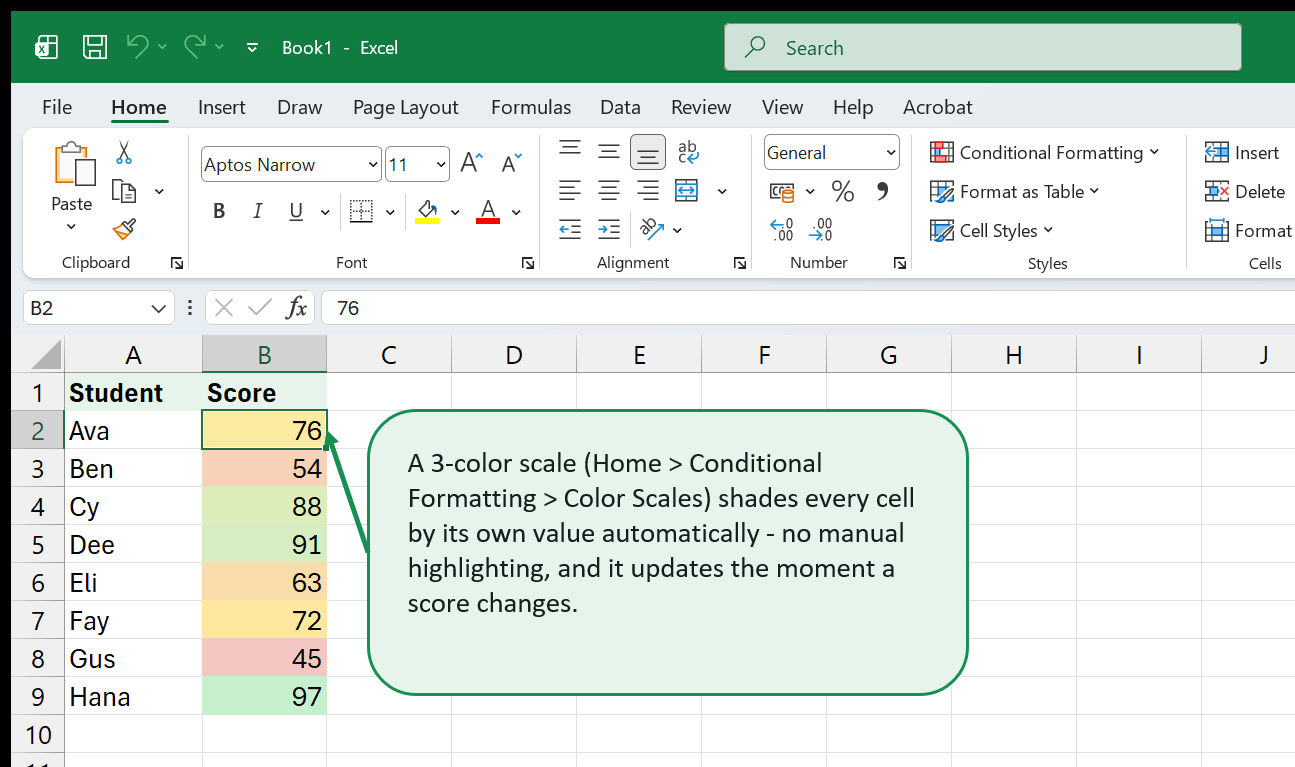
Use Case 4: Heat map of scores
A heat map uses color scales to show the distribution of values across a two-dimensional grid. In our gradebook, we can turn the entire score area into a heat map:
- Select
B2:E11(all scores, all students). - Home > Conditional Formatting > Color Scales - pick a 3-color scale (Red-Yellow-Green or any diverging palette).
Now every cell is shaded based on its value relative to the entire range. High scores glow green, middling scores are yellow, and low scores are red. You can instantly see patterns: which students are consistently strong, which are struggling, and which have one outlier score.
To make it more meaningful, edit the rule and set the midpoint to a fixed number (like 70) and the type to “Number” instead of “Percentile.” This anchors the midpoint to a meaningful grade threshold rather than the statistical middle of the data.
Use Case 5: Highlighting weekends in a date column
If column B contains dates and you want to shade weekends differently:
=OR(WEEKDAY($B2)=1, WEEKDAY($B2)=7)Select the entire row range and use this as a formula-based rule with a
light gray fill. The WEEKDAY function returns 1 for
Sunday through 7 for Saturday (by default). The $B locks the column to B,
so the entire row gets shaded when the date in column B is a weekend.
Use Case 6: Highlighting the active row (current date match)
In a schedule or log where column A has dates, you can highlight “today’s” row:
=$A2=TODAY()Apply a bold border or a distinct fill. Every morning when you open the workbook, the correct row will be highlighted automatically.
Use Case 7: Conditional formatting with ISBLANK
In data-entry sheets, you might want to flag required fields that haven’t been filled in yet:
=ISBLANK(B2)Apply a yellow fill to draw attention to missing data. Combine this with data validation for a complete data-entry quality system.
11. Performance and Troubleshooting
Goal: Diagnose and fix common conditional formatting problems, and keep your workbook fast.
Why is my rule not working?
This is the number-one question people ask about conditional formatting. Here is a systematic checklist:
1. Check the “Applies to” range. Open Manage Rules and verify the rule
applies to the cells you think it does. A common mistake: you set up the rule
on B2:E11, then inserted new rows or columns, and the range didn’t expand.
Fix it by editing the range in the Manage Rules dialog.
2. Check the formula references. If you’re using a formula-based rule, the references must be correct relative to the first cell in the “Applies to” range. If your range starts at A2 but your formula references B1, the row math is off by one. The easiest way to test: type the formula into a helper cell at the top-left corner of the range and see if it returns TRUE for cells that should be formatted and FALSE for cells that shouldn’t.
3. Check the $ signs. Missing or misplaced $ signs are the most
common cause of formula-based rules not working. Review Chapter 7’s
explanation of how references shift.
4. Check rule priority. A higher-priority rule may be overriding the one you’re looking at. Open Manage Rules and check the order. If a rule above yours sets the same format property (e.g., fill color) and its condition is also TRUE, it wins.
5. Check “Stop If True.” If a rule above yours has “Stop If True” checked and its condition is TRUE, your rule is never evaluated. Uncheck “Stop If True” or reorder the rules.
6. Check the cell’s actual value vs. display. A cell might display
“100” but actually contain the text “100” (not the number 100). A rule
that checks >90 won’t match text. Click the cell and look at the Formula
Bar to see its actual contents. You can use VALUE() in a formula-based
rule to force a text-to-number conversion, or fix the source data.
7. Check for extra spaces. A cell that looks like it says “Complete”
might actually contain “Complete “ (with a trailing space). A rule checking
for ="Complete" won’t match. Use TRIM in your formula:
=TRIM($D2)="Complete".
Too many rules: performance considerations
Conditional formatting is recalculated every time the worksheet recalculates. Each rule is evaluated for every cell in its “Applies to” range. If you have 20 rules, each applied to 10,000 cells, that’s 200,000 evaluations per recalculation.
For most worksheets, this is instant. But in very large workbooks (hundreds of thousands of cells, many rules, complex formulas in the rules), it can slow things down noticeably.
Tips for keeping performance healthy:
- Minimize the “Applies to” range. Don’t apply a rule to an entire
column (
A:A) if your data only occupies rows 2-100. UseA2:A100instead. Entire-column rules evaluate over a million cells. - Avoid volatile functions in rules. Functions like
TODAY(),NOW(),INDIRECT(),OFFSET(), andRAND()force recalculation every time anything on the sheet changes, not just the cells they reference. Use them sparingly. If you needTODAY(), consider putting the date in a helper cell and referencing that cell in the rule instead. - Use “Stop If True” for mutually exclusive rules. If you have five rules that represent five grade tiers, and each cell can only match one tier, checking “Stop If True” on each rule means Excel stops evaluating as soon as it finds a match - saving time on the remaining rules.
- Consolidate rules where possible. Five separate “Greater Than” rules
for five different thresholds can sometimes be replaced by a single
formula-based rule using
IFSor nestedIF- though this is a tradeoff between maintainability and performance. - Clear inherited rules. If you copied data from another workbook, it may have brought conditional formatting rules with it. Check Manage Rules and delete anything you didn’t create intentionally.
Conditional formatting and printing
Conditional formatting appears in print exactly as it appears on screen, including data bars, color scales, and icons. If you’re printing in black and white, test your formatting with a grayscale preview (File > Print, then check the preview) - red and green fills may look identical in grayscale. Consider using bold borders or font weight instead of fill colors when the output will be printed without color.
Conditional formatting and copy-paste
When you copy a cell that has conditional formatting and paste it somewhere else, the rule travels with the cell. The “Applies to” range in Manage Rules expands to include the pasted location. This is convenient if intentional, but it can create a mess if you copy-paste frequently - you might end up with dozens of rules, each applying to a different scattered range. To clean up, open Manage Rules periodically and consolidate or delete redundant rules.
If you want to paste values without bringing along the formatting, use
Paste Special (Ctrl+Alt+V) and choose “Values” instead of the default
“All.”
Conditional formatting and filtered/hidden rows
When you filter a table or hide rows manually, conditional formatting still applies to the hidden rows - it’s just not visible. This is normally fine, but it means that Top/Bottom rules still count hidden rows in their calculations. If you filter a table to show only one department and apply a “Top 3” rule, the top 3 are calculated across all rows (including hidden ones), not just the visible ones. The displayed result might show fewer than 3 highlighted cells if some of the actual top 3 are hidden by the filter.
If you need conditional formatting that respects the current filter, you’ll need a formula-based rule that incorporates the SUBTOTAL function, which ignores hidden rows. This is an advanced technique, but it’s worth knowing the limitation exists.
Conditional formatting across sheets
A conditional formatting rule can only format cells on the sheet where it’s defined - you cannot create a single rule that formats cells on Sheet1 based on a value on Sheet2. However, you can reference cells on another sheet in a formula-based rule. For example, if Sheet2!A1 contains a target score, you could use this formula on Sheet1:
=B2>Sheet2!$A$1The rule lives on Sheet1 and formats Sheet1 cells, but it reads the threshold from Sheet2. This is useful for dashboards where a settings sheet controls the formatting thresholds for multiple data sheets.
Conditional formatting in shared workbooks and co-authoring
When multiple people edit the same workbook (via OneDrive/SharePoint co-authoring), conditional formatting rules are shared - any change one person makes to a rule is visible to everyone. However, simultaneous edits to the same rule can occasionally cause conflicts. Best practice: have one person own the formatting rules, and others focus on data entry.
Conditional formatting and Excel versions
Most conditional formatting features work in Excel 2007 and later. Data bars, color scales, and icon sets were all introduced in Excel 2007. Some refinements - like the ability to show a bar border, or the “Show Bar Only” option - were added in Excel 2010. Formula-based rules have been available since Excel 2007. If you’re using Excel for the web (the browser version), you can view conditional formatting applied by the desktop app, and you can create basic Highlight and Top/Bottom rules, but formula-based rules and some advanced editing features require the desktop application.
If you’re working in Google Sheets instead of Excel, the concepts are nearly identical but the menus differ: go to Format > Conditional formatting instead of Home > Conditional Formatting. The formula-based rule option in Google Sheets is called “Custom formula is” and works the same way.
12. Where to Go Next
Goal: Connect what you’ve learned here to the rest of ExcelBack and to your own next steps.
You now have a complete toolkit for conditional formatting: preset rules for quick wins, formula-based rules for precision, and the management skills to keep everything organized as your workbooks grow. Here’s where to go from here.
Deepen your formula skills
Formula-based conditional formatting is only as powerful as the formulas you know how to write. If you want to go further:
- Excel for Beginners - if any of the
formula concepts in Chapters 7-8 felt unfamiliar, start here. It covers
cell references, the
$sign, and core functions from the ground up. - Excel Formulas Cheat Sheet - a quick-reference for 130 functions, each with syntax and a one-line description. Keep it open while you write conditional formatting formulas.
- XLOOKUP & VLOOKUP Field Guide
- lookup functions and conditional formatting are natural partners. Use XLOOKUP to pull a value from another table, then format based on the result.
Explore specific functions
Many of the formulas in this book used functions that have their own dedicated pages on ExcelBack:
- IF - the foundation of most conditional logic
- AND and OR - combine multiple conditions
- COUNTIF - count occurrences (duplicate detection)
- TODAY - date comparisons that update automatically
- ROW and MOD - alternating row patterns
- AVERAGE - dynamic average comparisons
- WEEKDAY - weekend and day-of-week detection
- ISBLANK - missing data detection
- TRIM - cleaning up text for reliable comparisons
- MAX and MIN - finding column extremes
Each function page includes syntax, examples, and common pitfalls.
Go hands-on with ExcelBack tools
The ExcelBack tools library includes interactive practice environments where you can experiment with formulas and formatting without risk to your own data.
Dive into related topics
- Conditional Formatting - the topic hub on ExcelBack, with additional articles, tips, and community questions.
- Data Validation - pairs naturally with conditional formatting. Validation prevents bad data from being entered; conditional formatting flags data that’s already there.
- Charts & Visualization - when in-cell formatting isn’t enough and you need a standalone chart.
- PivotTables - for summarizing large datasets before you format them.
Level up with intermediate skills
If you’re comfortable with everything in this book and want to take the next step:
- Excel Intermediate Skills - the paid companion that builds a complete workbook from scratch: lookups, named ranges, data validation, PivotTables, dashboards, and even your first macro, all in one continuous project.
- Pivot Tables from Zero - another deep dive into one of Excel’s most powerful features.
- Excel Shortcuts Handbook - speed
up every task with keyboard shortcuts, including the
Alt, H, Lconditional formatting shortcut mentioned in Chapter 8.
Keep practicing
The best way to internalize conditional formatting is to apply it to your own data. Pick a worksheet you use regularly - a budget, a project tracker, a client list, a sales report - and add one rule. Then add another. Within a week, you’ll find yourself reaching for conditional formatting as naturally as you reach for bold text.
The data is already in your spreadsheets. Now you know how to make it visible.
That's the whole book. Keep the PDF for offline reading.
Download PDF


