


MENU
Donate
=TOPIC

5 subtopics in this path

Charts & Visualization

Chart selection, formatting, combo charts, sparklines, conditional formatting, map-style visuals, and storytelling with data.

=SUBTOPICS

What to learn inside Charts & Visualization

Each item pairs the learning structure with curated public YouTube resources where available, so learners can move from outline to video practice quickly.

01Beginner

Choose the right chart

Pick bar, column, line, pie, scatter, or combo charts based on the question your data answers.

YOUTUBE
video / Intermediate

The Excel Timeline chart you'll actually keep using (free template included)

Leila Gharani

Open on YouTube (opens in a new tab)
Leila Gharani

Loading preview…

02Beginner

Format charts clearly

Clean titles, axes, labels, legends, colors, and gridlines so charts are easier to read.

YOUTUBE
video / Intermediate

Highlight Max & Min Values in an Excel Line Chart (Conditional Formatting in Charts)

Leila Gharani

Open on YouTube (opens in a new tab)
Leila Gharani

Loading preview…

03Intermediate

Combo charts and secondary axes

Combine chart types and use secondary axes without misleading the reader.

QUICK NOTES
  • Insert > Combo Chart lets each series pick its own chart type (e.g. bars for volume, a line for a percentage).
  • Only add a secondary axis when the two series genuinely use different units or scales -- adding one just to make a flat line look dramatic misleads the reader.
  • Label both axes clearly and, if possible, color each axis title to match its series so it's obvious which line belongs to which scale.
04Intermediate

Conditional formatting

Highlight trends, exceptions, heatmaps, duplicates, and top/bottom values directly in cells.

QUICK NOTES
  • Home > Conditional Formatting > Top/Bottom Rules flags the highest or lowest N values (or %) without a helper formula.
  • A three-color scale (green-yellow-red) makes a quick heatmap out of any numeric range -- select it, then Conditional Formatting > Color Scales.
  • Highlight Duplicate Values catches repeats instantly, but check whether near-duplicates (extra spaces, different casing) are slipping through uncaught.
05Intermediate

Sparklines and small visuals

Add compact trend visuals inside cells for dense reports.

QUICK NOTES
  • Insert > Sparklines offers Line, Column, or Win/Loss -- pick Win/Loss for data that's really just up-vs-down rather than exact magnitude.
  • Sparklines in the same group share one axis scale by default, which can flatten a small series next to a large one -- adjust this per group in Sparkline > Axis.
  • A cell with a sparkline can still hold a number in an adjacent cell -- pairing the two (trend + current value) reads better than either alone.
=PREVIEW

Excel in action: Charts & Visualization

Real Excel screenshots showing what this topic looks like in practice.

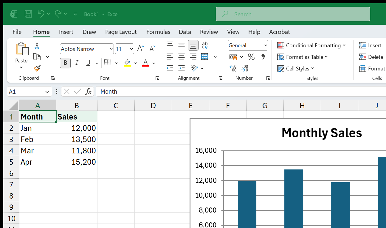
Creating a chart from selected data in Excel
=VIDEOS

YouTube resources for Charts & Visualization

video / Beginner

Excel Charts & Graphs: Learn the Basics for a Quick Start

Leila Gharani

Strong starter lesson for choosing, creating, formatting, and extending Excel charts.

Open on YouTube (opens in a new tab)
Leila Gharani

Loading preview…

video / Intermediate

Highlight Max & Min Values in an Excel Line Chart (Conditional Formatting in Charts)

Leila Gharani

Directly teaches dynamic chart highlighting, a key visualization skill beyond basic chart tutorials.

Open on YouTube (opens in a new tab)
Leila Gharani

Loading preview…

video / Intermediate

Pictogram Charts in Excel: Add Icons to Bars [Rounded + Dynamic]

Leila Gharani

Useful for making business charts more visual without leaving Excel.

Open on YouTube (opens in a new tab)
Leila Gharani

Loading preview…

video / Intermediate

The Excel Timeline chart you'll actually keep using (free template included)

Leila Gharani

Specialized chart tutorial for project and reporting timelines.

Open on YouTube (opens in a new tab)
Leila Gharani

Loading preview…

video / Intermediate

Make Beautiful Excel Charts Like The Economist

Leila Gharani

Teaches polished chart design for learners improving the visual quality of reports.

Open on YouTube (opens in a new tab)
Leila Gharani

Loading preview…

video / Intermediate

Interactive Excel Charts and Dashboards - Data Visualization Course

Simon Sez IT

Course-style framing and dashboard connection make it a strong visualization resource.

Open on YouTube (opens in a new tab)
Simon Sez IT

Loading preview…

video / Mixed

Excel Data Visualization Course - Guide to Charts & Dashboards

freeCodeCamp.org

Dedicated data-visualization course format is highly relevant for chart and dashboard learners.

Open on YouTube (opens in a new tab)
freeCodeCamp.org

Loading preview…

video / Beginner

Excel Charts and Graphs Tutorial

Kevin Stratvert

Accessible tutorial for learners who need a practical introduction to Excel chart creation.

Open on YouTube (opens in a new tab)
Kevin Stratvert

Loading preview…

video / Advanced

Advanced Excel Charts for Dashboards - Free Masterclass for Data Analysts

Chandoo

Targets advanced charting for dashboards, a strong match for visualization-focused paths.

Open on YouTube (opens in a new tab)
Chandoo

Loading preview…

video / Advanced

Build 5 ADVANCED Excel Charts from Scratch

Kenji Explains

From-scratch advanced chart builds help learners add sophisticated visuals to reports.

Open on YouTube (opens in a new tab)
Kenji Explains

Loading preview…

video / Mixed

Excel Quick and Simple Charts Tutorial

Technology for Teachers and Students

Extracted from saved YouTube search results - titled "Quick and Simple Charts", filed under Charts & Visualization for its charts coverage.

Open on YouTube (opens in a new tab)
Technology for Teachers and Students

Loading preview…

video / Mixed

Excel Data Visualization & Co-Authoring

Atil Gurcan

Extracted from saved YouTube search results - titled "Data Visualization & Co Authoring", filed under Charts & Visualization for its co-authoring coverage.

Open on YouTube (opens in a new tab)
Atil Gurcan

Loading preview…