

A PivotTable turns a long flat table into a summary - totals, counts, averages, broken out however you need - without writing a single formula. This book starts from a completely blank sheet and builds up: one dataset, used the same way in every chapter, so each new idea builds on the last instead of resetting the example every time. If you’ve already read Chapter 16 of Excel for Beginners, this is the deeper, hands-on version of that same gentle introduction.
What Is a PivotTable (and When to Use One)
A PivotTable answers questions like “how much did each category sell?” or “what’s the average order size by region?” by letting you drag column headers into four boxes - Rows, Columns, Values, and Filters - instead of typing a formula for every combination you want to see. Excel does the grouping and the math; you just decide what goes where.
Reach for a PivotTable when:
- You need to slice the same data multiple different ways (by category, then by region, then by month) without rebuilding anything each time.
- You’re exploring data you don’t fully understand yet, and want to try a few groupings quickly.
- The question itself might change - a PivotTable adapts by dragging a field to a new box; a formula-based summary usually needs rewriting.
Reach for a formula instead - SUMIFS is the most common one - when you need exactly one fixed number, like “total revenue where region is North,” embedded permanently in a report. A PivotTable is built for open-ended exploration; a formula is built for one specific, unchanging answer. Nothing stops you from using both in the same workbook.
Meet the Practice Data
Every screenshot in this book uses the same small sales log from a fictional hardware store, Bramwell Hardware - 15 rows, one per sale, spanning January through March 2026:
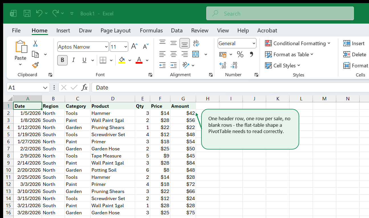
Seven columns: Date, Region (North or South), Category (Tools,
Paint, or Garden), Product, Qty, Price, and Amount
(=Qty*Price). This shape - one header row, one row per record, no blank
rows or columns, no merged cells, no subtotal rows mixed into the data - is
exactly what a PivotTable needs in order to read the data correctly. Get
this right first and every chapter after this one just works; get it wrong
and you’ll spend more time debugging “(blank)” categories and missing rows
than building anything.
Want to practice on a larger version of this exact idea? Download the PivotTable practice: sales transactions dataset - 300 rows of realistic sales data already shaped correctly, ready to build on right after this book.
Building Your First PivotTable
Click anywhere inside your data, then Insert → PivotTable. Excel guesses the used range automatically - confirm it looks right, choose New Worksheet, and click OK. A PivotTable Fields pane opens with every column header listed at the top, and four empty boxes below it: Filters, Columns, Rows, and Values.
Drag Category into Rows, then drag Amount into Values:
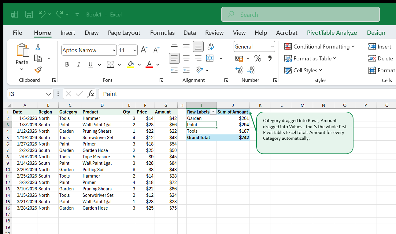
That’s it - two fields dragged into two boxes, and Excel has already totaled
Amount for every category and added a Grand Total row at the bottom. By
default, a numeric field dropped into Values gets summed; a text field
gets counted. The next few chapters build directly on this same pivot.
Rows, Columns, Values, and Filters
All four boxes can hold a field at once, and each does a different job:
| Box | What it does | In this example |
|---|---|---|
| Rows | Groups records down the left side | Category (Tools, Paint, Garden) |
| Columns | Breaks each row out side by side | Region (North, South) |
| Values | The number being summarized | Sum of Amount |
| Filters | A dropdown above the grid that limits the whole report | Product |
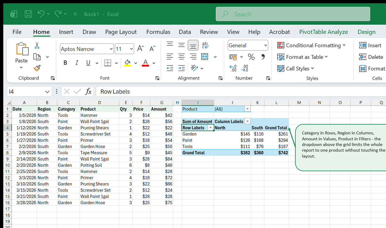
Notice the grid now has Grand Total in both directions - one per row (every category, both regions combined) and one per column (every region, all categories combined) - and the single cell at the bottom-right, $742, matches the very first pivot’s Grand Total exactly. That’s a useful sanity check any time you reshape a pivot: the overall total should never change, no matter which fields you move between boxes.
The Filters box doesn’t change the layout at all - it just adds a dropdown above the grid (currently showing “(All)”) that limits every number in the pivot to one product at a time, without touching Rows or Columns. Drag a field there when you want an occasional “just show me one [thing]” view without rebuilding the report.
Grouping Dates
Drag the raw Date column into Rows on a fresh pivot and Excel lists every individual date that appears in the source data - 15 separate rows for 15 sales, which is rarely what you actually want to see. Right-click any date in the Rows area, choose Group, and pick Months (Excel also offers Quarters, Years, and more, and you can select several at once):
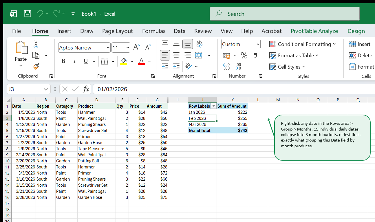
15 individual daily dates collapse into 3 month buckets, oldest first, each one totaled automatically. This is genuinely a one-click feature, not a formula or a helper column - Excel recognizes the field as a date and offers Seconds/Minutes/Hours/Days/Months/Quarters/Years as grouping levels because of that. If Group is greyed out or throws an error when you try it, the most common cause is that the column isn’t actually stored as real dates - text that merely looks like a date (often from a CSV import) won’t group. Fixing text that looks like a date is exactly the kind of cleanup Power Query is good at before it ever reaches a PivotTable.
Changing How Values Summarize
Excel picks Sum for numbers and Count for text automatically, but you’re not stuck with the default. Click the field’s name inside the Values box, choose Value Field Settings, and pick from Sum, Count, Average, Max, Min, and a few others. You can even add the same field to Values more than once with a different setting each time:
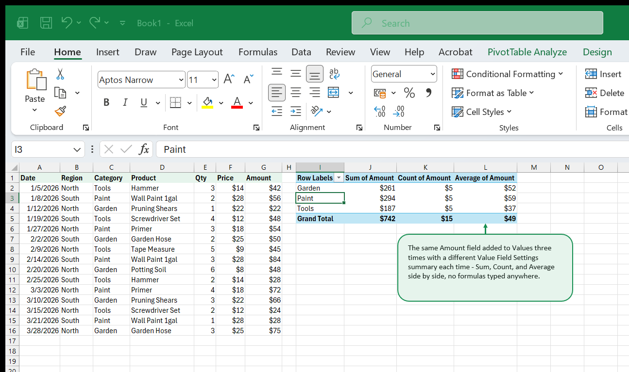
Sum of Amount confirms the category totals from earlier ($261 / $294 / $187). Count of Amount shows 5 sales in every category - this dataset was built with exactly 5 transactions per category, which is also a handy built-in check that nothing got miscategorized. Average of Amount is simply Sum ÷ Count for each row, computed for you.
One easy-to-miss detail visible in this exact screenshot: Count of
Amount displays with a dollar sign, even though a count should just be a
plain number. Excel copies the source field’s number format to every value
field built from it, so if Amount is formatted as currency, every
aggregation of Amount - Sum, Count, or Average alike - inherits that
currency format until you fix it. Right-click the field, Value Field
Settings → Number Format, and set Count back to a plain number.
Adding a Slicer
A field in the Filters box works, but it’s a dropdown menu you have to open to see the current selection or change it. A slicer turns that same filter into a strip of always-visible, clickable buttons instead. Select any cell in the pivot, then PivotTable Analyze → Insert Slicer, and pick a field - Region, in this example:
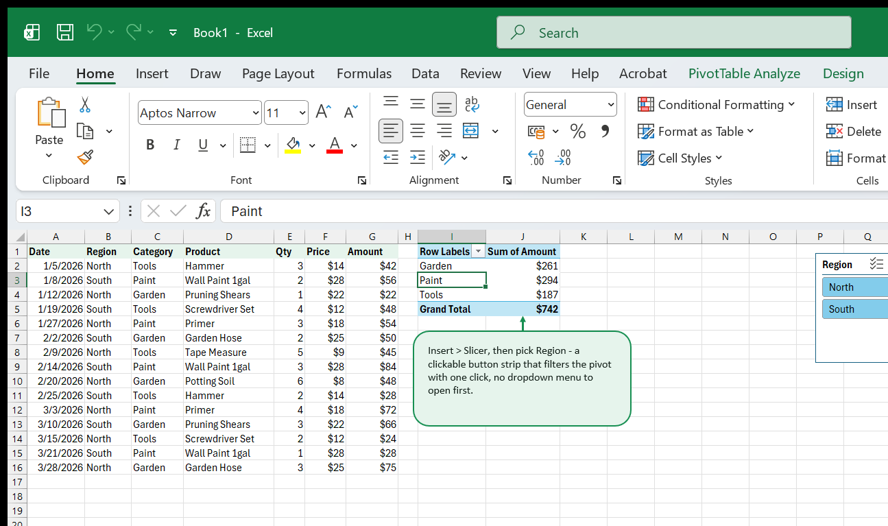
Click North and the pivot instantly recalculates to North-only totals; click South to switch, or hold Ctrl and click both to select them together. A slicer can filter more than one PivotTable at once (right-click the slicer → Report Connections) if you’ve built several pivots from the same source data - useful for a small dashboard where every chart and table should react to the same filter together.
Sorting and Filtering Within the Pivot
Two closely related but different tools live inside the pivot itself, beyond the Filters box: sorting the rows, and filtering which row labels show up at all (as opposed to filtering by a separate field). Filter this pivot down to Category = Tools using the Filters dropdown, then right-click any product’s row label and choose Sort → Largest to Smallest:
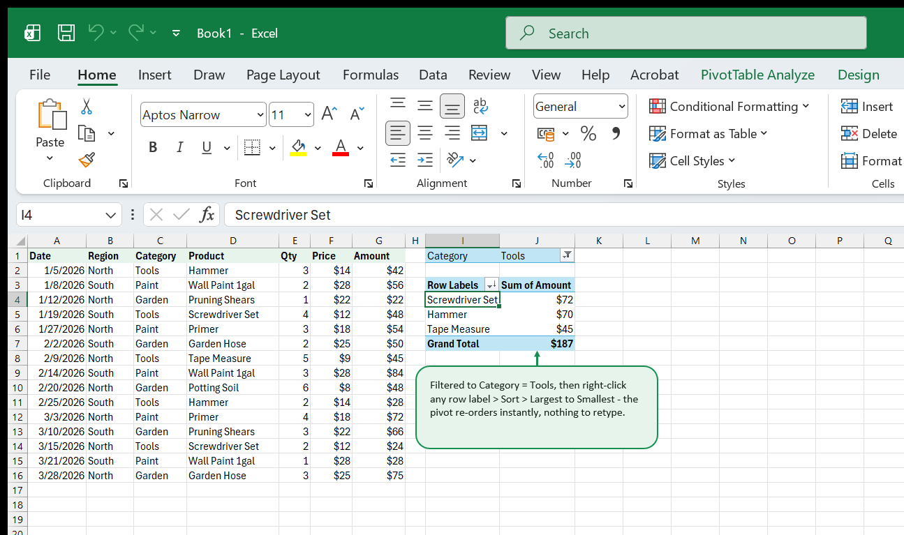
The row labels re-order instantly - Screwdriver Set first at $72, then Hammer at $70, then Tape Measure at $45 - with no retyping and no helper column. You can also filter which row items display without removing a field entirely: click the Row Labels dropdown arrow and untick any individual product you don’t want to see, independent of the Filters box above the grid. Between the Filters box, item checkboxes, and sort, there are three separate ways to control what a pivot shows - reach for whichever one matches what you’re trying to do: Filters for “swap between one thing and another,” item checkboxes for “hide these specific ones,” and sort for “reorder what’s already showing.”
Refreshing When Source Data Changes
This is the single most common PivotTable surprise for anyone new to them: a PivotTable never updates automatically when the source data changes. Edit a number, add new rows, delete a row - the pivot keeps showing whatever it last calculated until you tell it otherwise. Right-click anywhere inside the pivot and choose Refresh, or use Data → Refresh All to refresh every pivot, query, and connection in the workbook at once.
There’s a second, sneakier version of this same trap: rows added past
the original source range don’t get picked up even after a refresh. If
your source data started as A1:G16 and you paste 10 new rows below it,
Refresh alone won’t extend the pivot’s source range to include them - it
only reruns the calculation over the range it already knew about. Two
reliable fixes:
- Format the source range as a real Excel Table first (Insert → Table, or Ctrl+T). A Table’s range grows automatically as rows are added, and a PivotTable built from a Table grows with it - Refresh alone is then enough, permanently.
- If the source is already a plain range, use PivotTable Analyze → Change Data Source to manually repoint it at the new, larger range.
Converting the source to a Table before building the pivot in the first place avoids ever needing the second option.
Common Pitfalls
- “(blank)” showing up as a row or column. Almost always means there are empty cells somewhere in that field’s source column - find and fill (or remove) the blank cells, then refresh.
- Forgetting to refresh after editing source data - covered above, and worth repeating: no PivotTable auto-updates on its own.
- New rows past the original range not appearing - also covered above; format the source as a Table to fix this permanently.
VLOOKUP(...,TRUE)-style unsorted-data mistakes don’t apply here - a PivotTable groups by actual value, not by position, so source data doesn’t need to be pre-sorted the way some formula-based lookups do.- A value field inheriting the wrong number format - covered in the Value Field Settings chapter above; fix it per-field via Value Field Settings → Number Format, not by reformatting the source column (that would also reformat every other value field built from it).
- Grouping a text column that only looks like a date - Excel’s date grouping only works on a genuine date-typed column; text that merely displays like a date needs converting first.
Quick Reference
| Task | How |
|---|---|
| Insert a PivotTable | Click inside the data, Insert → PivotTable |
| Total a number by category | Drag the category into Rows, the number into Values |
| Break totals out side by side | Drag a second category into Columns |
| Add a “show one thing at a time” dropdown | Drag a field into Filters |
| Change Sum to Count/Average/Max/Min | Click the field in Values → Value Field Settings |
| Group dates into months/quarters/years | Right-click a date in Rows → Group |
| Add a clickable filter button strip | Select the pivot → Insert Slicer |
| Reorder rows by their value | Right-click a row label → Sort |
| Hide specific row items | Row Labels dropdown → untick items |
| Update after source data changes | Right-click pivot → Refresh, or Data → Refresh All |
| Make new rows always get picked up | Format source as a Table (Ctrl+T) before building the pivot |
Where to Go Next
- How to create a pivot table in Excel covers the same first steps from a slightly different angle, if a second explanation helps it click.
- PivotTables vs. formulas goes deeper on when to reach for each one.
- Turning a PivotTable into a manager-ready report is the natural next step once the basics here feel comfortable.
- Preparing messy data for a PivotTable covers the cleanup work that prevents most of the “(blank)” and miscounted-row problems in the Common Pitfalls chapter above.
- Browse the Pivot Tables topic for structured, in-depth coverage beyond this book.
- Practice on a bigger version of this exact dataset: the PivotTable practice: sales transactions dataset, 300 rows, already shaped correctly.
- New to Excel entirely? Excel for Beginners is the free starting point this book’s practice data assumes you’ve already got the basics from.
- Need a single fixed number instead of an interactive summary? The
Excel Formulas Cheat Sheet covers
SUMIFS,COUNTIFS, and every other function category on this site in one condensed reference.
That's the whole book. Keep the PDF for offline reading.
Download PDF


