

A well-built Excel dashboard does one thing: it tells a story at a glance. No hunting through tabs, no scrolling past walls of numbers, no asking a colleague what the colour-coding means. The person who opens it — a manager, a client, or yourself on a Monday morning — should be able to read the situation in under ten seconds. That is the standard this guide holds you to.
This ebook builds a complete Sales Performance Dashboard for Reyes Roastery, a fictional specialty coffee company with reps spread across four regions — North, South, East, and West. The dashboard tracks monthly revenue, units sold, attainment versus target, and rep-level performance. Every technique appears in the context of that one real-feeling scenario: KPI tiles, dynamic charts, filter controls, dynamic headlines, and protected delivery. By the end you will have a workbook you can adapt to your own data the same afternoon you finish reading.
You will need Excel 2019, Microsoft 365, or Excel for Mac 2019 or later. A few sections reference features that arrived in Excel 2021 (dynamic arrays, the SEQUENCE and XLOOKUP functions), and those are flagged clearly when they appear. For every modern formula, the traditional equivalent appears alongside it so you are not left behind on an older version. Keep this guide open beside Excel and build as you read — the skills stick far better that way than reading through and returning later.
What Makes a Dashboard Work
Before touching a single cell, it pays to understand what separates a dashboard from a report. A report presents data. A dashboard answers a question. The distinction matters because it determines every layout, formatting, and content decision you make.
For Reyes Roastery the central question is: how is the sales team performing against target this month, and which region needs attention? Every element on the finished dashboard — every tile, chart, and filter control — should help answer that question, or it should not be there. If an element does not help the reader answer the question faster or more confidently, it is clutter and it should be cut.
The three principles
One screen. A dashboard that requires scrolling stops being a dashboard and becomes a scrolling report. Design for a single 1920×1080 viewport on a monitor, or a single A4 landscape page for print. Anything that does not fit on that one surface belongs in a supporting sheet or a separate document. Resist the temptation to include context or background that the reader can always ask for separately.
Hierarchy of attention. The most important number should be the largest, boldest, most central element on the screen. Supporting context — trends, breakdowns, comparisons — sits below and around it. A reader who has never seen your dashboard before should look at it for three seconds and know the single most important fact without reading a label. If they cannot, the visual hierarchy is wrong. Decoration belongs nowhere near the headline figures.
Audience over aesthetics. A field sales manager needs actuals versus targets at a glance. A CFO needs revenue and margin. A logistics coordinator needs units shipped and fill rates. Before building anything, ask the audience a direct question: what is the one decision you make using this data? Build toward that decision, not toward what a generic dashboard “should” look like.
Five failure modes to avoid
Understanding what goes wrong is as useful as knowing what to aim for. These five mistakes appear in almost every workbook built by someone who has not yet thought carefully about dashboard design.
Too many KPIs. When everything is highlighted, nothing is. Five or six metrics in the headline row is the maximum that most screens can accommodate without the tiles becoming too small to read comfortably. Additional metrics belong in a supporting breakdown sheet that the audience can navigate to if they want detail.
Inconsistent number formatting. Revenue shown as £48,620 in one tile and as 48620.0 in another looks like a data quality problem rather than a formatting inconsistency. Define a formatting convention once and apply it everywhere: revenue in £#,##0, percentages in 0.0%, unit counts in #,##0 with no decimal places.
Chart types chosen for novelty. Radar charts, bubble charts, and 3-D pie charts appear in dashboards because they look distinctive. They communicate poorly compared to bars and lines, which audiences read without effort. Use chart types your audience already understands fluently.
Static labels on dynamic data. A chart titled “Monthly Revenue” when the filter is set to a specific region is not wrong, but it is an opportunity missed. A title that reads “Monthly Revenue — North Region, March 2026” answers a question before it is asked. Every label that refers to a time period or filter selection should be a formula, not typed text.
No refresh discipline. A dashboard that still shows March data in April erodes trust in everything it displays. Either automate the refresh with a Workbook_Open macro (Chapter 10) or document the manual steps clearly inside the file.
Planning Your Layout Before You Build
Sketching a layout on paper before opening Excel is the single habit that most distinguishes experienced dashboard builders from beginners. It costs five minutes and prevents hours of rearranging cells and moving charts later.
The four layout zones
Draw a rectangle representing your screen. Every element on the dashboard belongs in one of four zones, arranged from top to bottom:
Headline strip. Company name, dashboard title, and the dynamic “as of” date or filter summary. One row of cells, full width. This is where the dynamic title formula lives, and it is the first thing every reader sees.
KPI tile row. Four to six large-number tiles directly below the headline strip. This is where the reader’s eye lands first after the headline. Each tile shows one number with a small label above it and a comparison indicator — versus target, versus prior period — below it. Bigger is better: these numbers should be visible across the room.
Chart area. One large primary chart on the left or centre and one or two supporting charts to the right or below. The primary chart should answer the audience’s central question directly — for Reyes Roastery, that is the monthly revenue trend compared with the prior year. Supporting charts provide breakdown and context.
Control strip. Slicers or drop-down controls, typically docked to the right side of the headline or to the top-right of the chart area, so they remain visible and accessible without obscuring the data.
Sheet structure
Three sheets, clearly named, is the right architecture for a dashboard workbook of this kind.
| Sheet | Purpose | Visible to audience? |
|---|---|---|
| RawData | Source transactions, one row per sale, never edited by users | No — hidden before sharing |
| Calcs | KPI formulas, chart data tables, helper lists, named ranges | No — hidden before sharing |
| Dashboard | The presentation view: tiles, charts, controls, headline | Yes — the only visible sheet |
The separation between Calcs and Dashboard matters. Dashboard cells should contain only references to Calcs cells — =Calcs!D2 — not the SUMIFS formulas themselves. This way, any formula error appears in Calcs where it can be debugged, rather than on the face of the dashboard where the audience will see it.
Grid setup
Set the column width across the entire Dashboard sheet to a narrow value — width 3 is a good starting point — using Home > Format > Column Width. This creates a fine grid that makes it easy to align tiles and charts precisely without fighting the default wide columns. Each KPI tile will span roughly 10–12 of these narrow columns.
Turn off gridlines on the Dashboard sheet before placing any element: View > uncheck Gridlines. Working on a clean white surface makes it far easier to judge spacing and visual balance.
Structuring the Data Model
A dashboard is only as reliable as the data feeding it. Time spent on data structure now pays back many times over when new data arrives and everything updates cleanly without any formula maintenance.
Converting the source range to an Excel Table
Click anywhere in the raw sales data and press Ctrl+T (or Insert > Table). Confirm that “My table has headers” is ticked, then click OK. Immediately name the table tblSales: click inside the table, go to the Table Design tab, and type the name in the Table Name box at the far left of the ribbon.
The Reyes Roastery source table has these columns. Column letters are approximate — what matters is the header text.
| Header | Type | Sample value |
|---|---|---|
| SaleDate | Date | 01/03/2026 |
| Region | Text | North |
| Rep | Text | Adaeze Okonkwo |
| Category | Text | Espresso Beans |
| Units | Whole number | 24 |
| Revenue | Currency | 864.00 |
| Cost | Currency | 432.00 |
| Target | Currency | 900.00 |
The Table format delivers three benefits that directly affect the dashboard. First, every formula referencing tblSales[Revenue] expands automatically when new rows are added — no OFFSET tricks, no range updates. Second, the structured reference syntax makes every formula in the Calcs sheet self-documenting: tblSales[Revenue] explains itself; $F$2:$F$10000 does not. Third, sorting or filtering tblSales never breaks any formula that references it by column name.
Adding helper columns
Add four calculated columns inside the table. Excel auto-fills the formula to every row the moment you press Enter in the first data row.
Margin — revenue minus cost, needed for a gross margin KPI tile:
=[@Revenue]-[@Cost]Margin % — with IFERROR to handle any rows where Revenue is zero:
=IFERROR(([@Revenue]-[@Cost])/[@Revenue],0)MonthNum — for filtering by month in SUMIFS:
=MONTH([@SaleDate])YearNum — for filtering by year and for year-over-year comparisons:
=YEAR([@SaleDate])Checking data quality
Before building any formulas on top of the data, a brief quality check prevents silent errors later. Three checks cover the most common problems.
Duplicate rows. Select the table, go to Data > Remove Duplicates, tick SaleDate, Rep, and Revenue, and click OK. Review the count Excel reports before confirming — a surprisingly high number suggests a paste error, and the correct response is to cancel and investigate before removing anything.
Blank cells in filter columns. In a spare cell, write =COUNTBLANK(tblSales[Region]). A non-zero result means some rows have no region assigned and will be invisible to the Region filter on the dashboard. Find those rows and assign them a value.
Numbers stored as text. Select the Revenue column and check the status bar at the bottom of the screen. If SUM shows 0 but COUNT shows the right row count, the values are stored as text. Select the column, click the warning triangle that appears near the top-left, and choose Convert to Number.
Defining named ranges for the filter controls
Three cells on the Calcs sheet hold the user’s current filter selections. Every KPI formula reads from these cells, so changing a single selection refreshes every tile simultaneously. Create these names in Formulas > Name Manager > New:
| Name | Cell | Default value | Meaning |
|---|---|---|---|
rng_SelMonth |
Calcs!$B$2 |
0 | Selected month (0 = all months) |
rng_SelRegion |
Calcs!$B$3 |
All | Selected region (“All” = all regions) |
rng_SelYear |
Calcs!$B$4 |
2026 | Selected year (four-digit number) |
Set the default values in those cells now. That way you can test every formula as you write it without first building the filter controls.
Building KPI Tiles with SUMIFS and Named Ranges
KPI tiles are the headline numbers — the figures a reader absorbs in the first few seconds. Each tile needs a label, a primary value, and a comparison: versus target, versus last period, or versus last year.
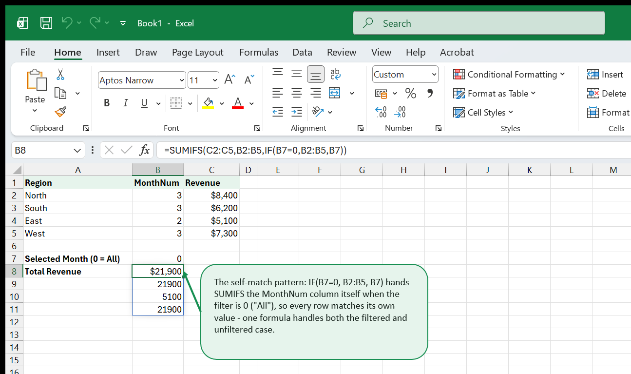
The self-match pattern for flexible filters
The central challenge in a filter-driven KPI formula is making it return a total when the “all” option is selected. The pattern used throughout this chapter is to test whether the filter is in its “all” state and, if so, match the criteria column against itself — which is always true for every row:
=SUMIFS(
  tblSales[Revenue],
  tblSales[MonthNum],  IF(rng_SelMonth=0,  tblSales[MonthNum],  rng_SelMonth),
  tblSales[YearNum],   rng_SelYear,
  tblSales[Region],    IF(rng_SelRegion="All", tblSales[Region], rng_SelRegion)
)
When rng_SelMonth is 0, IF(rng_SelMonth=0, tblSales[MonthNum], rng_SelMonth) returns the MonthNum column itself as the criteria. Every row matches because each row’s MonthNum equals itself. When rng_SelMonth is 3, the criteria is the number 3, and only March rows match. The same logic handles the Region filter.
Total Revenue tile
In Calcs!D2, write the Revenue SUMIFS formula using the pattern above:
=SUMIFS(tblSales[Revenue],tblSales[MonthNum],IF(rng_SelMonth=0,tblSales[MonthNum],rng_SelMonth),tblSales[YearNum],rng_SelYear,tblSales[Region],IF(rng_SelRegion="All",tblSales[Region],rng_SelRegion))Format the cell as currency (£#,##0) and name it kpi_Revenue using the Name Box. Naming the output cells makes the Dashboard references cleaner to read.
Target and Attainment tiles
The target sum uses the same filter pattern but sums the Target column:
=SUMIFS(tblSales[Target],tblSales[MonthNum],IF(rng_SelMonth=0,tblSales[MonthNum],rng_SelMonth),tblSales[YearNum],rng_SelYear,tblSales[Region],IF(rng_SelRegion="All",tblSales[Region],rng_SelRegion))Attainment as a percentage — with IFERROR to prevent a division-by-zero error when no rows match the filters:
=IFERROR(D2/D3,0)Units Sold tile
=SUMIFS(tblSales[Units],tblSales[MonthNum],IF(rng_SelMonth=0,tblSales[MonthNum],rng_SelMonth),tblSales[YearNum],rng_SelYear,tblSales[Region],IF(rng_SelRegion="All",tblSales[Region],rng_SelRegion))Average Deal Size tile
Divide total revenue by the number of matching transactions using COUNTIFS with the same filter pattern:
=IFERROR(D2/COUNTIFS(tblSales[MonthNum],IF(rng_SelMonth=0,tblSales[MonthNum],rng_SelMonth),tblSales[YearNum],rng_SelYear,tblSales[Region],IF(rng_SelRegion="All",tblSales[Region],rng_SelRegion)),0)Top Region tile
To show the name of the best-performing region, build a four-row regional summary in Calcs!G2:H5 — region names in G, revenue in H. In H2, write a SUMIFS for the North region referencing G2 as the criteria (then copy down through H5 for South, East, and West):
=SUMIFS(tblSales[Revenue],tblSales[Region],G2,tblSales[MonthNum],IF(rng_SelMonth=0,tblSales[MonthNum],rng_SelMonth),tblSales[YearNum],rng_SelYear)Return the name of the top region with INDEX/MATCH:
=INDEX(G2:G5,MATCH(MAX(H2:H5),H2:H5,0))Year-over-year comparison
For a tile showing the revenue change versus the same period last year, calculate last year’s revenue using rng_SelYear-1 in the year criteria:
=SUMIFS(tblSales[Revenue],tblSales[MonthNum],IF(rng_SelMonth=0,tblSales[MonthNum],rng_SelMonth),tblSales[YearNum],rng_SelYear-1,tblSales[Region],IF(rng_SelRegion="All",tblSales[Region],rng_SelRegion))Year-over-year change percentage in the next cell:
=IFERROR((D2-D8)/D8,0)Presenting tiles on the Dashboard sheet
Each tile occupies a merged block of cells on the Dashboard sheet, approximately 10 columns wide and 6 rows tall on the narrow-column grid. Within each block: label text (small, grey, centred) in the top two rows; primary value (large, bold, 28pt, centred) in the middle two rows; comparison indicator text (small, coloured) in the bottom two rows. Reference Calcs cells from the Dashboard — never copy formulas directly to Dashboard.
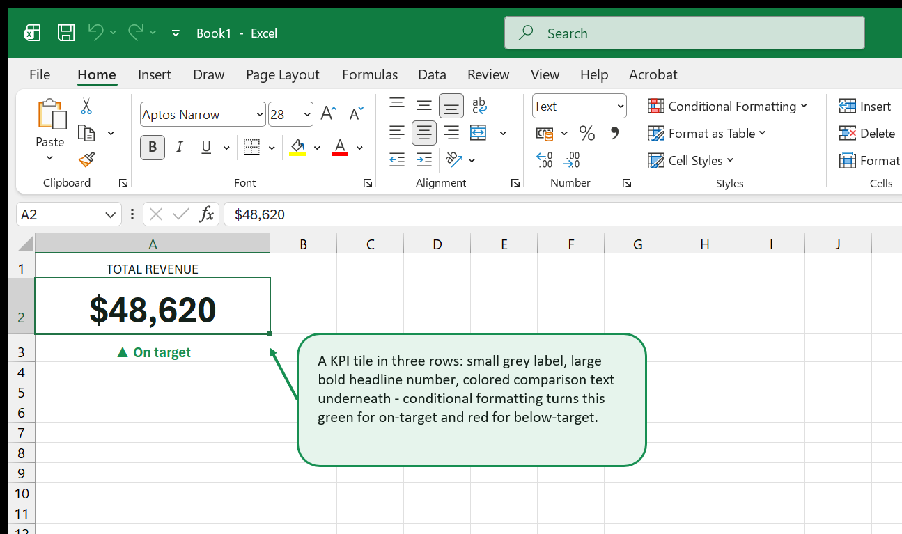
For the attainment indicator at the bottom of the Revenue tile:
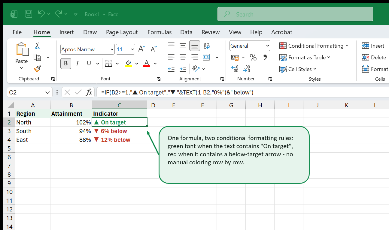
=IF(Calcs!D4>=1,"▲ On target","▼ "&TEXT(1-Calcs!D4,"0%")&" below")Apply two conditional formatting rules to this cell: if the cell text contains “▲” set the font to green (#1D7044); if it contains “▼” set the font to red (#C0392B). Use Home > Conditional Formatting > New Rule > Format only cells that contain > Specific Text.
Choosing the Right Chart for Each KPI
Every chart type makes an implicit claim about the data. A line chart says “watch how this changes over time.” A horizontal bar chart says “rank these categories against each other.” Choosing the wrong type misleads the reader even when the underlying numbers are perfectly accurate.
Chart type guide
| Question | Best type | Avoid |
|---|---|---|
| How has revenue changed over time? | Line (one line per year) | 3-D bar, area with fill |
| Which region sells most? | Horizontal bar, sorted | Radar, donut, stacked column |
| How is each rep ranked? | Horizontal bar, sorted descending | Vertical bar when names are long |
| What share does each category hold? | Donut, maximum 5 segments | 3-D pie, nested donut |
| Actual vs. target side by side? | Clustered column | Stacked area, deviation line |
For Reyes Roastery, three charts cover everything the audience needs. The Monthly Revenue Trend is a line chart with two series, 2025 and 2026, plotted on the same axis so the reader can compare the same period across years in a single glance. The Revenue by Region chart is a clustered horizontal bar sorted descending so the top region is always at the top. The Top 5 Reps chart is another horizontal bar driven by LARGE formulas so it updates dynamically as filter selections change.
Building the Monthly Revenue Trend data table
In Calcs!M1:O13, create a summary table with one row per month:
| Column | Content |
|---|---|
| M | Month name (Jan through Dec) |
| N | 2025 revenue for that month, filtered by region |
| O | 2026 revenue for that month, filtered by region |
In N2, use SUMIFS with a fixed year and ROW()-1 as the month number:
=SUMIFS(tblSales[Revenue],tblSales[MonthNum],ROW()-1,tblSales[YearNum],2025,tblSales[Region],IF(rng_SelRegion="All",tblSales[Region],rng_SelRegion))The expression ROW()-1 returns 1 in row 2 (January), 2 in row 3 (February), and so on through 12 in row 13 (December). Copy the formula down through row 13, then write the same formula in column O with the year changed to 2026. The line chart built on this table responds immediately to any change in the Region filter.
Making Charts Dashboard-Ready
A chart freshly inserted from Excel defaults looks like a worksheet chart — a white box with a border, grey plot area, default colour palette, and a legend positioned at the bottom. Four edits transform it into a dashboard element that looks considered and intentional.
Remove the chart frame
Click the chart to select it. On the Format tab, click Format Selection (or press Ctrl+1) to open the format pane. Set Border to No line and Fill to No fill. The chart now floats against the dashboard background rather than sitting in a separate white box.
Apply a consistent colour scheme
For Reyes Roastery the palette is:
| Role | Hex |
|---|---|
| Primary series (current year) | #0D7377 |
| Comparison series (prior year) | #B2BEC3 |
| On-target / up indicator | #1D7044 |
| Below-target / down indicator | #C0392B |
| Dashboard background | #F8FAFB |
| Tile background | #FFFFFF |
Click a series bar or line, press Ctrl+1, and set Fill > Solid fill > Color using the hex code under More Colors > Custom. Repeat for every series in every chart. When all three charts share one palette, the dashboard reads as a single designed system rather than a set of independent charts.
Write dynamic chart titles
Click a chart title text box. In the formula bar, type = followed by the cell reference for the headline cell on Dashboard:
=Dashboard!B2The chart title now shows the assembled dynamic headline — “Revenue by Region — March 2026 — North” — and updates whenever any filter changes. Never type a static title directly into a dashboard chart. Static titles go stale the moment the period changes, and stale labels destroy trust in the data much faster than any underlying formula error would.
Remove visual noise
Work through this checklist for each chart before moving on:
- Legend: Delete it when there is only one series. On a two-series chart, move the legend inside the plot area and reduce the font to 8pt.
- Gridlines on bar charts: Remove them. The data labels make them redundant. Right-click a gridline and choose Delete.
- Gridlines on line charts: Keep them, but format them light grey (
#EEEEEE, 0.5pt). They help readers estimate values on the y-axis without distracting from the lines. - Data labels: Add them to bar charts via right-click > Add Data Labels, position Inside End, white bold 8pt. Readers should not need to cross-reference the axis.
- Gap width: Open Format Data Series and reduce Gap Width from the default (~150%) to 60–80%. Narrower bars look more confident.
- Plot area fill: Set to No fill so the chart background matches the dashboard background colour (
#F8FAFB).
Adding sparklines to KPI tiles
A sparkline shows a trend in a single cell with no chart object. For the Revenue tile, select the bottom cell of the tile block, go to Insert > Sparklines > Line, and set the data range to the monthly revenue values from the Calcs sheet’s trend table (column O for 2026). Under Sparkline Color apply the primary teal. Under Markers, enable the Last marker in dark teal so the most recent data point is visually anchored.
The sparkline gives the tile a glanceable trend context — the reader immediately sees whether the headline number has been climbing or falling — without consuming any extra dashboard area. A tile with a sparkline answers two questions at once: what is the current figure, and is it going up or down?
Adding Slicers and Drop-Down Controls
Controls give the dashboard its interactive quality. A static dashboard is a report. A dashboard with working filters is a tool that the audience returns to repeatedly because it answers new questions on demand.
Choosing between slicers and drop-downs
Excel offers two fundamentally different control approaches. PivotTable slicers are visual button-grid panels that filter one or more connected PivotTables simultaneously. They are built-in, easy to style, and require no formula work — but they only work when the KPI calculations are driven by PivotTables.
Data Validation drop-downs write a selected value into a cell, which formulas then read. They work with any formula-based calculation engine, including the SUMIFS approach used in this ebook. They require a little more setup but integrate cleanly with the named range filter cells defined in Chapter 3.
This chapter uses Data Validation drop-downs. If your own dashboard uses PivotTables, the slicer approach is described at the end of this section.
Setting up the Month drop-down
In Calcs!A20:A32, create a list of month options — “All Months” first, then the twelve month names. Name this range lst_Months using Name Manager. On the Dashboard sheet, select the control cell and go to Data > Data Validation > Allow: List. In the Source box type =lst_Months.
In Calcs!B2 (rng_SelMonth), convert the selected text to the corresponding month number:
=IFERROR(MATCH(Dashboard!E2,Calcs!A20:A32,0)-1,0)MATCH returns the row position within the list (1 for “All Months”, 2 for January, and so on). Subtracting 1 converts the position to a month number: 0 for “All Months”, 1 for January. All SUMIFS formulas reading rng_SelMonth respond immediately.
Setting up the Region drop-down
In Calcs!E2:E6, list the region options: “All”, “North”, “South”, “East”, “West”. Name this range lst_Regions. Add a Data Validation drop-down on Dashboard pointing to =lst_Regions. In Calcs!B3 (rng_SelRegion), link directly to the drop-down:
=Dashboard!G2Making the region list dynamic
If the list of regions might grow, make the lst_Regions name dynamic using OFFSET so the drop-down expands automatically when a new region is added to column E:
=OFFSET(Calcs!$E$2,0,0,COUNTA(Calcs!$E:$E)-1,1)Redefine the lst_Regions name to use this formula in Name Manager. The -1 excludes the header row. Now adding a new region to Calcs!E automatically includes it in the drop-down with no further maintenance.
PivotTable slicers (alternative approach)
If the dashboard runs on PivotTables, click anywhere inside a PivotTable and go to PivotTable Analyze > Insert Slicer. Select Region and Month. Drag both slicer panels onto the Dashboard sheet and resize them to fit the control strip area from the wireframe.
To connect a slicer to multiple PivotTables simultaneously, right-click the slicer and choose Report Connections. Tick every PivotTable that should respond to the filter. A single Region slicer click then updates every PivotTable — and every chart built from those PivotTables — in one action.
Style slicers to match the dashboard: right-click > Slicer Settings > New Slicer Style. Apply the primary teal to the selected button state and light grey to unselected.
Dynamic Headlines with TEXT and & Formulas
A dashboard title that always shows the current filter selection confirms to the reader — without requiring any cognitive effort — that what they see reflects the choices they have made. A static title creates doubt. A dynamic title builds trust.
The TEXT function
TEXT converts a numeric value into a formatted string. The syntax is TEXT(value, format_code). The format code uses the same characters as a cell format string: “mmmm yyyy” produces “March 2026”, “£#,##0” produces “£48,620”, “0.0%” produces “93.5%”. The result is always a text string, which means it can be joined to other strings using the & operator.
Common format codes for dashboard headlines:
| Format code | Input | Output |
|---|---|---|
| “mmmm yyyy” | DATE(2026,3,1) | March 2026 |
| “mmm-yy” | DATE(2026,3,1) | Mar-26 |
| “£#,##0” | 48620 | £48,620 |
| “0.0%” | 0.935 | 93.5% |
| “#,##0” | 1840 | 1,840 |
| “0.0x” | 2.3 | 2.3x |
Building the headline formula
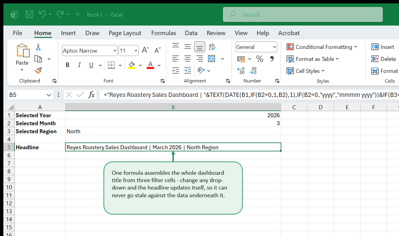
In Dashboard!B2, the formula assembles the full headline from the three filter selections. It has three parts joined by &: a fixed prefix, a dynamic date expression, and a conditional region suffix.
="Reyes Roastery — Sales Dashboard | "&TEXT(DATE(rng_SelYear,IF(rng_SelMonth=0,1,rng_SelMonth),1),IF(rng_SelMonth=0,"yyyy","mmmm yyyy"))&IF(rng_SelRegion="All"," | All Regions"," | "&rng_SelRegion&" Region")The date section deserves a close look. DATE(rng_SelYear, IF(rng_SelMonth=0, 1, rng_SelMonth), 1) constructs a date from the selected year and month. When the user has selected “All Months” and rng_SelMonth is 0, the IF substitutes month 1 to avoid an invalid date. The outer IF then switches the TEXT format code to “yyyy” so only the year appears in the headline — the substituted month 1 is never shown.
Embedding formatted KPI values in prose labels
Some dashboard layouts include a brief summary sentence above the chart area that states the headline finding in plain English. This is particularly useful when the file is exported as PDF and distributed without context.
="In "&TEXT(DATE(rng_SelYear,IF(rng_SelMonth=0,6,rng_SelMonth),1),IF(rng_SelMonth=0,"yyyy","mmmm"))&", Reyes Roastery generated £"&TEXT(Calcs!D2,"#,##0")&" in revenue ("&TEXT(Calcs!D4,"0%")&" of target)."Period-over-period change indicators
For the year-over-year tile sub-label, a directional arrow and plain English communicate more immediately than a raw percentage:
=IF(Calcs!D9>=0,"▲ Up ","▼ Down ")&TEXT(ABS(Calcs!D9),"0.0%")&" vs same period last year"Where Calcs!D9 holds the year-over-year change percentage calculated in Chapter 4. The directional character, the magnitude formatted by TEXT, and the plain-English suffix — this is the clearest way to express a change in a KPI tile without requiring any mental arithmetic from the reader.
Protecting the Dashboard and Hiding the Workings
A dashboard sent to stakeholders must be protected from accidental edits. It should also present only the polished view — the workings on Calcs and the source data on RawData belong out of sight.
How Excel’s lock model works
Every cell in Excel has a Locked property, which is ticked on by default. Locking a cell does nothing until sheet protection is applied. The correct workflow is therefore: unlock the specific interactive cells first, then apply protection, which enforces the Locked state on everything else.
Unlocking interactive cells
On the Dashboard sheet, select every cell the user must be able to interact with — the two drop-down cells, the month control, the region control. Hold Ctrl to select non-adjacent cells. Open Format Cells (Ctrl+1) and go to the Protection tab. Untick Locked. Click OK. These cells are now unlocked; everything else on Dashboard remains locked.
Applying sheet protection
Go to Review > Protect Sheet. Enter a password. Under “Allow all users to:”, leave only Select unlocked cells ticked. Unticking “Select locked cells” prevents users from even clicking on KPI tiles, which stops accidental Delete keypresses from clearing a tile’s formula reference. Click OK and confirm the password.
Test the protection: try clicking a KPI tile and pressing any key. Excel should display a protection warning. Then verify both drop-down controls still work and that changing a selection updates the KPI tiles.
Protecting the Calcs sheet and workbook structure
Apply the same sheet protection to Calcs, this time removing even “Select unlocked cells” from the allowed actions. Calcs should never be visible or interactive for end users.
Right-click the RawData tab and choose Hide. Repeat for Calcs. The workbook now opens directly on Dashboard with no other sheets visible.
To prevent users from unhiding these sheets, go to Review > Protect Workbook, tick Structure, and set a password. With workbook structure protection active, the right-click menu on any tab does not offer an Unhide option.
Controlling display on open with VBA
Paste this procedure into the ThisWorkbook module (open with Alt+F11, then double-click ThisWorkbook in the Project panel):
Private Sub Workbook_Open()
    With ActiveWindow
        .Zoom = 85
        .DisplayHeadings = False
        .DisplayGridlines = False
        .DisplayWorkbookTabs = False
    End With
End Sub
This procedure fires every time the workbook opens. It sets the zoom to 85% — typically the level at which a 1920×1080 screen shows the full dashboard without scrolling — and removes row/column headings, gridlines, and the sheet tab strip. The effect is a presentation-quality display that appears immediately, before the reader has a chance to see the default Excel chrome. Save the file as .xlsm after adding any VBA code.
Sharing and Refreshing
A dashboard that refreshes in three clicks will be used daily. One that requires a ten-step manual process will be opened once, found stale, and quietly abandoned.
Documenting the refresh process
Before hiding RawData, add an instruction block in the rows above the tblSales header — rows 1 through 6, visible only when the sheet is temporarily unhidden. Include: where the source data comes from (export filename, system name, contact person); which columns must be present and in what order; the steps to paste new data and trigger a refresh; and the keyboard shortcut Ctrl+Alt+F5 (Refresh All) if PivotTables are used.
Automating refresh with VBA
For workbooks that use PivotTables, refresh all pivot caches automatically on open by adding this to the Workbook_Open procedure:
Private Sub Workbook_Open()
    Dim pc As PivotCache
    For Each pc In ThisWorkbook.PivotCaches
        pc.Refresh
    Next pc
    Calcs.Range("B2").Value = Month(Now())
    Calcs.Range("B4").Value = Year(Now())
    Calcs.Range("B3").Value = "All"
    With ActiveWindow
        .Zoom = 85
        .DisplayHeadings = False
        .DisplayGridlines = False
    End With
End Sub
The PivotCaches loop refreshes every PivotTable before the reader sees the dashboard. The three Calcs range assignments reset the filters to the current month and year, so the dashboard always opens on the most recent completed period regardless of what filter state it was in when last saved.
Sharing via OneDrive or SharePoint
Save the workbook to a OneDrive or SharePoint folder and share a link with the audience. Stakeholders can open the file in Excel for the web and interact with Data Validation drop-downs and chart filters directly in the browser without installing Excel.
Test the browser experience before distributing: open the link in Excel Online, click both drop-down controls, and verify that changing a selection updates the KPI tiles and charts. Note that VBA macros do not run in Excel Online — the Workbook_Open auto-refresh will not fire, but all formula-based interactivity works correctly.
Exporting a PDF snapshot
For archived monthly records or board pack submissions, export a PDF: File > Export > Create PDF/XPS. Choose Current sheet, set orientation to Landscape under Options > Page Setup, and publish.
Before exporting, set the filters to the most useful state for the snapshot — typically the completed prior month and all regions. Optionally update the Dashboard subtitle cell with a note such as “Archived 31 March 2026” before exporting, then revert it afterwards.
Handling new data each month
The data refresh workflow for Reyes Roastery is four steps. Unhide RawData. Paste the new month’s rows below the last row of tblSales — the Table expands automatically, adding new rows to every formula that references tblSales[Revenue] with no updates required. Press Ctrl+Alt+F5 to refresh all PivotTables if used. Re-hide RawData and save.
That is the complete process. No formula ranges to extend, no chart source ranges to update, no named ranges to redefine. The structured Table format plus the named-range filter architecture absorbs new data invisibly.
Where to Go Next
The dashboard built in this guide covers the core pattern: a structured data model, filtered KPI calculations, styled interactive charts, filter controls, dynamic text, and a protected, shareable delivery. Each of these topics has significantly more depth once the foundation is solid.
Go deeper on charts. The dashboard charts in this guide use the essential techniques — dynamic source ranges, custom colour palettes, data labels, and formula-driven titles. Excel Charts and Data Visualization covers the full territory: dual-axis combo charts that overlay a bar and a line series on the same chart, custom data callouts, bullet charts for compact target-versus-actual display, and sparkline variations for embedding trend indicators directly inside table cells.
Strengthen the formula layer. The SUMIFS patterns in this guide are a gateway to a much richer family of functions. XLOOKUP replaces VLOOKUP and INDEX/MATCH with a cleaner syntax and better handling of not-found cases. FILTER, UNIQUE, and SEQUENCE return dynamic arrays that resize automatically as data changes, replacing helper tables that currently need to be the right size. Excel Intermediate Skills covers all of these with Reyes Roastery as the running example — the same workbook structure, so each new formula you learn slots directly into the dashboard you have built here.
Add conditional formatting intelligence. The KPI tile comparison indicators in this guide use simple formula-based text and font colour rules. A full conditional formatting layer — colour scales on regional performance tables, icon sets replacing numbers with directional arrows, data bars embedded in rep-performance cells, and formula-driven rules that shade entire rows — can turn a supporting breakdown sheet into a scannable heat map that complements the dashboard tiles.
Automate the refresh cycle. The VBA snippets in Chapter 10 are starter code. A production automation layer — importing a CSV from a network folder on open, validating the column structure, running a data quality check, refreshing all PivotTables, saving a timestamped PDF to a SharePoint archive, and emailing the PDF to a distribution list — is entirely achievable with the Excel object model. Each of these tasks is a short procedure that builds on the Workbook_Open pattern introduced here.
Explore Power Query for larger data sources. Once the source data grows beyond a few thousand rows, or arrives from multiple systems that need to be merged and cleaned before loading, the manual paste-into-RawData workflow shows its limits. Power Query, accessed via Data > Get Data, connects directly to CSV files, SQL databases, SharePoint lists, and web APIs, applies a repeatable transformation pipeline, and loads a clean result into tblSales with a single click. The dashboard architecture stays exactly as built here — Power Query simply replaces the manual paste step with an automated query refresh.
Want a realistic dataset to build a dashboard on right now? Download PivotTable practice: sales transactions - 300 rows of date, region, product, rep, and amount data, already shaped like tblSales in this guide.
That's the whole book. Keep the PDF for offline reading.
Download PDF


