

Monthly sales report checklist for Excel
Watch alongside this article
Public YouTube resources matched to this article's topic, functions, and practice goal.
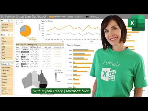
Interactive Excel Dashboards & ONE CLICK Update!
MyOnlineTrainingHub
Open on YouTube (opens in a new tab)
A monthly sales report should answer a few questions quickly: what happened, where it happened, why it matters, and what needs attention next.
Start with the report questions
- Total sales for the month
- Sales versus target
- Sales by region, product, channel, or salesperson
- Top and bottom performers
- Open risks, late orders, or unusual movement
If a chart does not answer one of these questions, it probably belongs in a detail sheet instead of the front page.
Use separate sheets
Keep the workbook easy to review:
Inputsfor targets and assumptionsDatafor cleaned transaction rowsChecksfor control totals and missing fieldsReportfor the manager-facing summary
This structure makes the file easier to update each month without rebuilding the whole report.
Add checks before charts
Before formatting the dashboard, confirm:
- The month filter matches the reporting period
- Blank customer, region, and product fields are fixed
- The total sales value matches the source system
- Target values exist for every reporting group
Keep the first page quiet
Use a small set of visuals: headline KPIs, one trend chart, one category comparison, and one exception list. The best report is not the one with the most charts. It is the one that makes the next decision obvious.
Go deeper with this skill
Build a report page that makes the key result obvious and keeps supporting detail close by. For this article, the goal is to practice: A practical checklist for building a monthly sales report that managers can scan, trust, and reuse.
Practice workbook setup
Use a clean data table, one summary sheet, and one final dashboard or report sheet.
Practice workflow
- Choose three to five metrics before designing the layout.
- Create a rough wireframe using plain cells before adding charts or formatting.
- Link KPI cards, charts, and tables back to the same clean source or summary layer.
- Add a refresh date and a note explaining the data source.
Quality checks
- The top-left area answers the main business question.
- Charts and tables use consistent date ranges and filters.
- The report can be printed or exported without cutting off important content.
Common mistakes
- Starting with colors and chart types before choosing the message.
- Mixing manual numbers with formula-driven results.
- Leaving slicers or filters in a state that hides important data.
Next actions
- Create a second view for a different audience, such as manager vs analyst.
- Add a short review checklist for monthly refreshes.
Formula focus: test SUMIFS(), XLOOKUP() with normal rows, blank inputs, and at least one edge case.


