

Build a one-page KPI dashboard in Excel
Watch alongside this article
Public YouTube resources matched to this article's topic, functions, and practice goal.
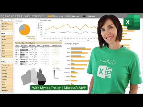
Interactive Excel Dashboards & ONE CLICK Update!
MyOnlineTrainingHub
Open on YouTube (opens in a new tab)

4 Hidden Excel Dashboard Design Tips for Beautiful Reports
Leila Gharani
Open on YouTube (opens in a new tab)The monthly sales report checklist on this site covers the questions a good report should answer and the sheet structure that keeps it maintainable. This article is the layout itself — what an actual one-page KPI section looks like, cell by cell, and why it’s built that way.
What the finished layout looks like
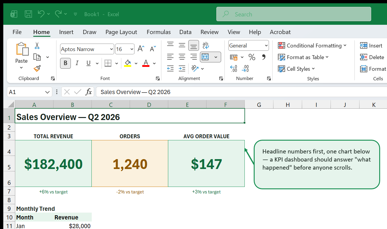
Three things are doing the actual work here, and none of them is complicated on its own:
- Three KPI cards, not ten. Total Revenue, Orders, and Average Order Value — the three numbers this audience actually asks about first. Every additional card competes with these for attention; if a metric isn’t one of the first three questions someone asks in a meeting, it belongs on a detail sheet, not the front page.
- One supporting chart, showing the trend behind the headline number, not a second unrelated metric.
- Color that means something, not decoration.
Building a KPI card
Each card is a merged block of cells, not a shape or a text box, which keeps it simple to update and to reformat later:
- Select the cells for the card body (here, a 2-column-by-3-row block) and Merge & Center them.
- Set a large font size (24–28pt) for the number itself, and a small, bold, uppercase label above it (“TOTAL REVENUE”) in a separate merged cell.
- Fill the card with a soft tint — not a saturated color — so the large number stays the thing your eye lands on, not the background.
- Add a small variance line under the number (“+6% vs target”) in the same color family as the fill, so the color and the words agree with each other. Never let color be the only signal; see conditional formatting for KPI flags for the full rule set on thresholds and color-blind-safe labeling.
The color itself is worth deciding deliberately before you touch the fill
color picker: green for on-target, amber for a small miss worth watching, and
save a stronger color for a genuine miss — exactly the thresholds from the KPI
flags article above. A SUMIFS or IF-based formula usually calculates the
underlying number and its variance; the card just formats the result.
Why the chart goes below, not beside
It’s tempting to put the trend chart next to the KPI cards so everything fits in one screenshot. In practice, a reader’s eye goes top-to-bottom and left-to-right — headline numbers first, supporting detail after. Putting the chart directly underneath the cards it explains keeps that order intact. If the dashboard needs a second chart (a category breakdown, say), it goes below the first one, not beside the cards.
Keeping it maintainable
The chart and cards above should reference a small data table further down
the same sheet (or, for anything past a single month of history, a separate
Data sheet) — never hardcoded numbers typed directly into the card. That way
next month’s refresh is “update the data table” or “refresh the query,” not
“retype six numbers and hope nobody notices a typo.” Once the layout itself is
right, preparing an Excel dashboard for PDF export
covers turning this same sheet into a clean PDF for anyone who reads it
outside Excel — and if the dataset behind it has genuinely outgrown a
worksheet, preparing Excel data for a Power BI handoff
is the natural next read.
Go deeper with this skill
Build a report page that makes the key result obvious and keeps supporting detail close by. For this article, the goal is to practice: A worked layout for a scannable, one-page Excel dashboard — headline KPI cards, a supporting trend chart, and the design decisions that keep it readable instead of busy.
Practice workbook setup
Use a clean data table, one summary sheet, and one final dashboard or report sheet.
Practice workflow
- Choose three to five metrics before designing the layout.
- Create a rough wireframe using plain cells before adding charts or formatting.
- Link KPI cards, charts, and tables back to the same clean source or summary layer.
- Add a refresh date and a note explaining the data source.
Quality checks
- The top-left area answers the main business question.
- Charts and tables use consistent date ranges and filters.
- The report can be printed or exported without cutting off important content.
Common mistakes
- Starting with colors and chart types before choosing the message.
- Mixing manual numbers with formula-driven results.
- Leaving slicers or filters in a state that hides important data.
Next actions
- Create a second view for a different audience, such as manager vs analyst.
- Add a short review checklist for monthly refreshes.
Formula focus: test SUMIFS(), IF() with normal rows, blank inputs, and at least one edge case.


