

Preparing Excel data for a clean Power BI handoff
Watch alongside this article
Public YouTube resources matched to this article's topic, functions, and practice goal.
Secrets to Building Excel Dashboards in Under 15 Minutes & UPDATES with 1 CLICK!
MyOnlineTrainingHub
Open on YouTube (opens in a new tab)

The Microsoft Excel Dashboard Masterclass - Don't Miss It Part-1
Data with Decision
Open on YouTube (opens in a new tab)Most Excel workbooks that eventually connect to Power BI don’t need to be rebuilt for it. They need to be cleaned up for it — and that cleanup is ordinary Excel work you can do without opening Power BI at all. This isn’t a Power BI tutorial; it’s what to fix on the Excel side before anyone hands a workbook off.
If you’re still deciding whether your workbook needs Power BI at all, read Power BI vs Excel dashboards first — this article picks up once that answer is “yes, eventually” and covers getting the data ready in the meantime.
The shape Power BI actually wants
Power BI’s Get Data > Excel Workbook, and Excel’s own Power Query engine underneath it, both read a workbook the same way: they look for a table shape — one header row, one row per record, no gaps. Report-style layouts that look perfectly clear to a person (a title banner, a blank row, merged cells across a subtotal) actively confuse that import.
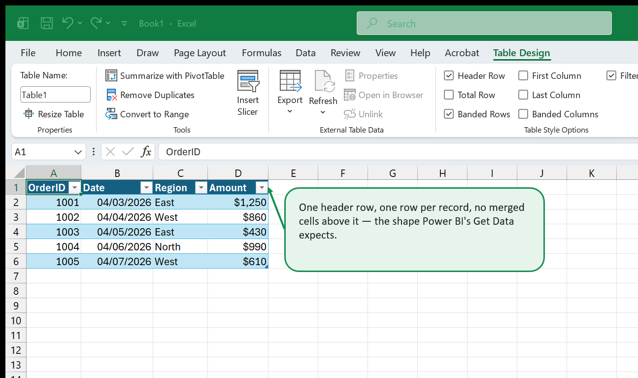
The concrete checklist, all of it ordinary Excel cleanup:
- One header row, at row 1 or as close to it as practical. A title, a logo, or a “Prepared by” line sitting above the real headers gets read as data by a naive import; if you need that banner for humans, keep it in a separate sheet, not above the header row of the data itself.
- No merged cells inside the data range. A merged “Q1” cell spanning three month columns reads as one column named “Q1” with two blank neighbors — not what it looks like on screen. This is the same underlying problem covered in Excel Tables vs. named ranges: formatting for humans and structuring for formulas (or, here, for an import) are two different jobs.
- One consistent type per column. A quantity column with “120”, “N/A”, and “pending” mixed in gets imported as text, which quietly breaks every numeric calculation downstream. Fix mixed types before the handoff, not after someone reports that a total is wrong.
- No subtotal or grand-total rows mixed into the data. A “Total” row sitting inside the data range gets summed as if it were another record, silently doubling your totals. Put totals below the range, or better, leave them out of the data table and calculate them in the reporting layer instead.
- Format the range as a real Excel Table (Ctrl+T). A Table has a defined, named boundary that a Power BI or Power Query connection can point at directly, and — same as in combo charts and dynamic chart ranges — it grows automatically as new rows are added, so the connection doesn’t need to be re-pointed at a wider range every refresh.
The part that’s genuinely shared
Power Query is not a Power BI feature that Excel happens to also have — it’s the same transformation engine underneath both. If you already clean data in Excel with Power Query (see getting started with Power Query), those query steps are the closest thing to a real bridge between the two tools: the same “remove these columns, split this one, filter these rows” logic applies whether the query lives in a workbook or in a Power BI report. Building and testing that transformation in Excel first — where it’s faster to inspect a preview table and fix a step — before anyone repeats it in Power BI is a reasonable division of labor, not a workaround.
What round-tripping actually looks like
A common pattern once both tools are in play: Excel (or a Power Query connection to a shared file or database) stays the place data gets entered and lightly maintained, and Power BI is where it’s modeled and distributed more widely. That only works smoothly if the Excel side stays exactly the shape described above on every refresh — a one-time cleanup followed by someone reformatting the sheet back into a “prettier” report layout next month undoes the whole point. Whoever owns the workbook after the handoff needs to know that the clean Table structure is now load-bearing, not just a formatting choice.
Go deeper with this skill
Build a report page that makes the key result obvious and keeps supporting detail close by. For this article, the goal is to practice: You don't need to learn Power BI to make your Excel data ready for it. The shape your data needs to be in, and what to fix in Excel before anyone connects a report to it.
Practice workbook setup
Use a clean data table, one summary sheet, and one final dashboard or report sheet.
Practice workflow
- Choose three to five metrics before designing the layout.
- Create a rough wireframe using plain cells before adding charts or formatting.
- Link KPI cards, charts, and tables back to the same clean source or summary layer.
- Add a refresh date and a note explaining the data source.
Quality checks
- The top-left area answers the main business question.
- Charts and tables use consistent date ranges and filters.
- The report can be printed or exported without cutting off important content.
Common mistakes
- Starting with colors and chart types before choosing the message.
- Mixing manual numbers with formula-driven results.
- Leaving slicers or filters in a state that hides important data.
Next actions
- Create a second view for a different audience, such as manager vs analyst.
- Add a short review checklist for monthly refreshes.
Formula focus: even if this workflow is not formula-heavy, add one check cell that confirms the final output still matches the source data.


