

Power BI vs Excel dashboards: has your workbook outgrown Excel?
Watch alongside this article
Public YouTube resources matched to this article's topic, functions, and practice goal.

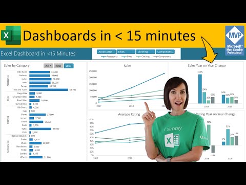
Secrets to Building Excel Dashboards in Under 15 Minutes & UPDATES with 1 CLICK!
MyOnlineTrainingHub
Open on YouTube (opens in a new tab)
Excel can build genuinely good dashboards. The question is not “which tool is better” — it’s whether your specific workbook has hit limits that Excel was never designed to solve.
When Excel dashboards are still the right call
If the data fits comfortably in a worksheet or two, refreshes once a day or less, and gets shared with a handful of people who already have the file or access to SharePoint, Excel wins on speed. You can build a dashboard with pivot tables, slicers, and conditional formatting in an afternoon, and anyone on the team can open it and tweak a formula without learning a new tool. Excel is also better when the layout needs to be free-form — mixing commentary, ad hoc calculations, and visuals on the same sheet.
Signs you’ve genuinely outgrown it
A few concrete signals, not just “the file feels slow”:
- Data volume: your source data is in the millions of rows, or the workbook’s file size and calculation time have become a daily complaint. Power BI’s data model compresses and handles this far better than a worksheet or even Power Pivot in an xlsx file.
- Refresh needs: you need scheduled, automatic refreshes from live databases or cloud sources without someone opening the file and clicking refresh.
- Sharing to many viewers: you need to distribute one report to dozens or hundreds of people, each seeing only their own region or team’s data (row-level security), without emailing a copy of the file to each person.
What Power BI costs you
Power BI isn’t a free upgrade. Building real reports means learning a new model — Power Query for shaping data (which overlaps with what you may already know from Excel) plus DAX for measures, which is a different language with its own logic. Sharing reports beyond a small team typically requires paid licensing, and the flexible, anything-goes layout of an Excel sheet becomes a more structured, tile-based report canvas. Migrating an existing dashboard workbook is real work, not a file conversion.
How to choose
Stay in Excel if the audience is small, the data fits, and refreshes are occasional. Move to Power BI when the data has genuinely outgrown a worksheet, refreshes need to run on a schedule from live sources, or the report needs to reach a wide audience with different data permissions per viewer. A common middle step: keep building the underlying data model in Excel and Power Query, and only move the presentation layer to Power BI once sharing becomes the bottleneck.
If that middle step is where you are, preparing Excel data for a Power BI handoff covers the concrete cleanup — table shape, types, no merged cells — that makes the eventual connection painless whenever you get there.
Go deeper with this skill
Build a report page that makes the key result obvious and keeps supporting detail close by. For this article, the goal is to practice: A practical guide to knowing when a dashboard workbook still belongs in Excel and when the data volume or audience means it's time to move to Power BI.
Practice workbook setup
Use a clean data table, one summary sheet, and one final dashboard or report sheet.
Practice workflow
- Choose three to five metrics before designing the layout.
- Create a rough wireframe using plain cells before adding charts or formatting.
- Link KPI cards, charts, and tables back to the same clean source or summary layer.
- Add a refresh date and a note explaining the data source.
Quality checks
- The top-left area answers the main business question.
- Charts and tables use consistent date ranges and filters.
- The report can be printed or exported without cutting off important content.
Common mistakes
- Starting with colors and chart types before choosing the message.
- Mixing manual numbers with formula-driven results.
- Leaving slicers or filters in a state that hides important data.
Next actions
- Create a second view for a different audience, such as manager vs analyst.
- Add a short review checklist for monthly refreshes.
Formula focus: even if this workflow is not formula-heavy, add one check cell that confirms the final output still matches the source data.


